Residential Case Study
Introduction
This application and company, Rent Right LLC, will allow renters (i.e. tenants) to immediately report any/all issues with amenities and essentials included in their lease agreement, and to schedule repair services with applicable third party service companies all in one place.
The owner of the rental space, i.e. the management team, will be the direct client of Rent Right LLC. Third party repair services will be a direct client of said owner/management.
Each will be a client of Rent Right LLC, at two different tiers.
Following the “mobile first” principle, my goal was to create a clickable prototype of the mobile version of the product, using my skills in UX/UI-related design. With this principle being utilized, the web version of the product would be made available later. With common sense as the next guiding principle, the mobile version prototype of Rent Right LLC should be in beta mode, and successfully operating, prior to web-launch.
This case study covers the process of creating this application as an LLC for a mobile platform, from idea to prototype.
This case study will explain the design processes, applied design thinking, design challenges and their solutions, found and decided. Beginning with the research, and ending with the clickable prototype, this document will cover every step in the process overall in detail. This is for the purpose of clarity, understanding, and presentation.
My Roles
Market Researcher
UX/UI Researcher
UX/UI Strategist
Content Strategist
UX/UI Designer
Project Manager/Lead
Product Designer
Visual Designer
Branding Consultant
Problem Overview
It started with a broken refrigerator, somewhere in an antiqued apartment complex, somewhere within the outskirts of the Greater Boston area. The entire area, and state, also just went into complete lockdown and shutdown, too.
After approximately 3 weeks from breakage to completed repair, I remember thinking to myself that there simply had to be a better way to live and manage quality of life.
The timeframe of events can be broken down like this:
Day 1: The refrigerator broke, shutting off, in the tenant’s apartment. The tenant then calls the owner to report this event, and requests help/repair. The owner does not answer, so a voicemail is left regarding the broken amenity, already impacting the quality of the tenants life (via rules of common sense)
Day 2: All perishable food that had been stored in said broken refrigerator/amenity has now spoiled.
Day 4: Owner returns call and requests more information. Within pandemic protocols, the owner agrees to meet at tenants' apartment to assess the problem reported.
Day 7: Owner arrives at the tenants apartment, and tries to repair the refrigerator themself. Owner is however unable to repair the broken amenity on this day, and orders the part they believe will help them to repair the broken amenity.
Day 15: The part ordered arrives at the owner’s address, and the owner contacts the tenant affected to schedule a date of return to repair the broken amenity. This is scheduled for three days later due to conflicting schedules.
Day 18: The owner repairs the broken amenity for the tenant themselves.
Problem Overview (cont’d)
In related issues regarding quality of life, let’s go back to the perishable versus non-perishable food diet, and its effects on the human body via physical, mental, and emotional categories.
To begin with common sense, we can rule perishables as a healthier diet, while non-perishables would be less healthy as the first thing that comes to mind for perishables are fruits, vegetables, meat/proteins, dairy, etc. And since our tenant in this case study no longer has the means to eat healthier because they cannot store it, let’s consider the side effects of the tenants quality of life already via a dietary lens here.
According to the LifeHealth Network here, “The mind sympathizes with the stomach. The pneumogastric nerve is what establishes this connection between the brain and the stomach (2). Overeating causes our minds to be clouded, forgetful, and irritable. Keeping our stomach in a healthy condition will keep the mind vigorous.”
The mental impact is one side effect our tenant is already facing, and the additional potential overall health issues become compounded to the list.
To learn more about how food changes impact quality of life, and more, continue to the Research section below.
With all of the above in mind, and more, my Challenge here was to create a prototype to ensure amenities and essentials that impact the quality of life for tenants can be resolved within a reasonably timely manner (i.e. within 3 days due to our refrigerator example as the baseline). Create a prototype that also organizes this information and invoicing for owners and third party services, all within one space for each, in a singular platform. The owner/management team would be the mobile applications direct client.
The primary user would be the renter, as they would be the first to ‘trigger’ the chain of events in report>schedule>management approval>third party repair service.
Users:
Renter/Tenants
Owner of rental space/Management team
A. Owner
B. Team Member(s)
Third Party Service Company
A. Management
B. Service Techs
Solution: Renters can report problems and schedule repair services within the same place via mobile application. Owners/management of the rental place can approve service repairs for all tenants in an organized, singular place. This would decrease the amount of work for management in scheduling on behalf of tenants, while also improving their business via word-of-mouth alone in maintaining quick-repair times and short time frames of negative impact for their tenants/i.e. customers. Third party services can organize their workday via the same mobile app, acquire entire apartment complexes at a time for customer bases, and both third party and management teams have everything in one place for tax time via the archive of invoices.
By creating a mobile application for each user type, and less “work” overall for each, there is no negative outcome for any user type or party. All, ideally, benefit from this platform, it’s organization and overall maintenance for all.
Market Research
A heuristic analysis of competitors within renter-related market, with amenity repair features in mind.
The question I had initially asked was along the lines of “does anything like my idea in mind exist? I asked the following questions in the research conducted via both web and mobile based applications to thoroughly examine and determine the market.
Are any similar online services on the market? Are there many applications/services exactly like mine?
Study competitor’s red route functions and make note of related-market information to include, or rather add to, my idea, my design. What are the strengths of any related service/applications?
Study competitor’s red route functions and find potential issues within their constraints to avoid in my design. What are their weaknesses?
My idea needs to remain a unique user experience. Can I validate this in my research findings?
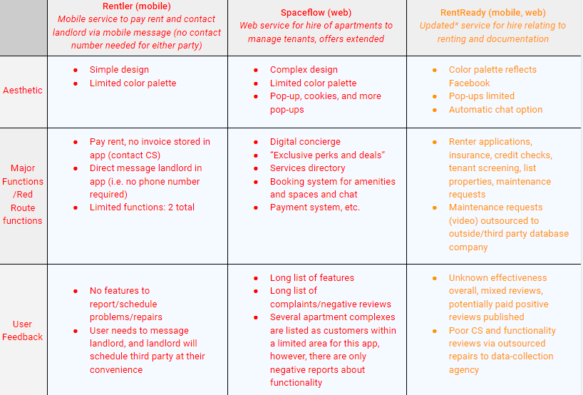
Heuristic analysis of competitors table. Please note that this case study was based on an idea initially from 2020. The information in yellow has been updated in 2021, as a landlord-centric application has come to market as a competitor to my tenant-focused design here.
Market Research Summary
Initial research was conducted March 2020 (start of pandemic), and “RentRedi” was found as the main competitor in research as of June 2021.
My conclusion remains as an idea that could be “just right” for all users, and customer service reps, repair techs, and so on. User’s pain points were found to be regarding the added “maintenance request” feature of “RentRedi” to an outsourced data-collection company, deferring and scheduling said repairs without training. My concept must be organized, managed, and maintained effectively.
Users for other applications were limited to a singular feature or arguably too many to manage properly overall; i.e. the market overall covers simple and complex, but my idea is in the middle, and could be a niche of “just right.”
Overall UI of each appeared borrowed from one another. My design must be unique, like my initial idea itself.
User Interviews
Challenge: Obtain general information regarding renting apartments via a questionnaire online.
Solution: Create a persona to use in the upcoming design based on the questionnaire, and (applicable) user interviews.
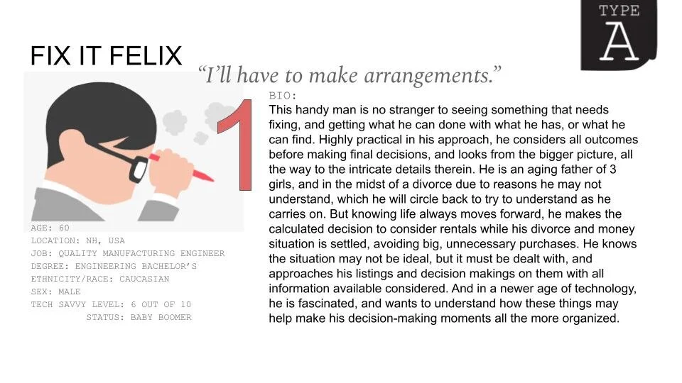
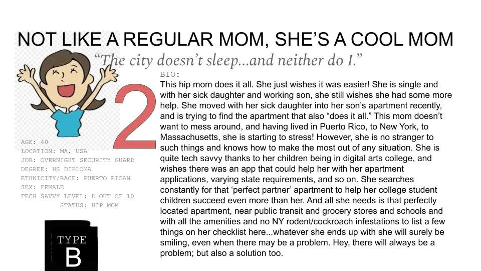
Of the above questionnaire’s participants, I interviewed several potential users. In analyzing the data collected, I decided to narrow my focus to 2 potential users, i.e. personas, in particular.
I decided this based on the extreme nature of their answers, the number of examples provided by said two that overlapped with all others, these two had the most detail and number of examples over a span of multiple decades worth of time as well. They represented the extremity my idea wished to solve for, and the simplicity, i.e. middle ground, required for the times to cover all applicable ages. All applicable ages included “baby boomers” and so I interviewed these two during a pandemic where meetings and resources were also limited.
A copy of my interview questions are here for reference.
Synthesizing
the Research (Affinity/Empathy Mapping)
Challenge: Obtain general information regarding renting apartments via a questionnaire online.
Solution: Create a persona to use in the upcoming design based on the questionnaire, and (applicable) user interviews.
Of the above questionnaire’s participants, I interviewed several potential users. In analyzing the data collected, I decided to narrow my focus to 2 potential users, i.e. personas, in particular.
I decided this based on the extreme nature of their answers, the number of examples provided by said two that overlapped with all others, these two had the most detail and number of examples over a span of multiple decades worth of time as well. They represented the extremity my idea wished to solve for, and the simplicity, i.e. middle ground, required for the times to cover all applicable ages. All applicable ages included “baby boomers” and so I interviewed these two during a pandemic where meetings and resources were also limited.
A copy of my interview questions are here for reference.
I compiled all major talking points in these interviews to summarize all I learned and to develop the user persona to design for via affinity and empathy mapping techniques.
The user persona was created via the affinity and empathy maps below.
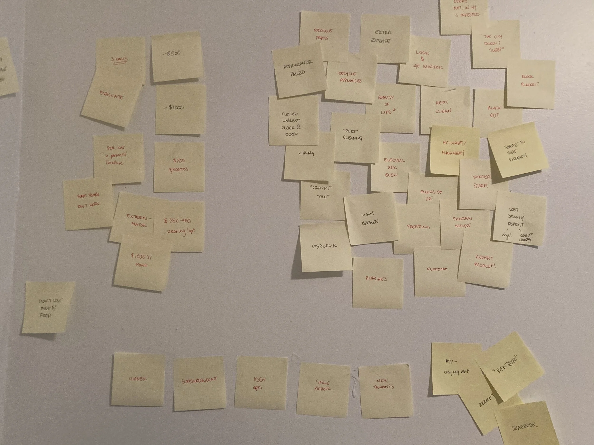
Affinity Map 1

Affinity Map 2
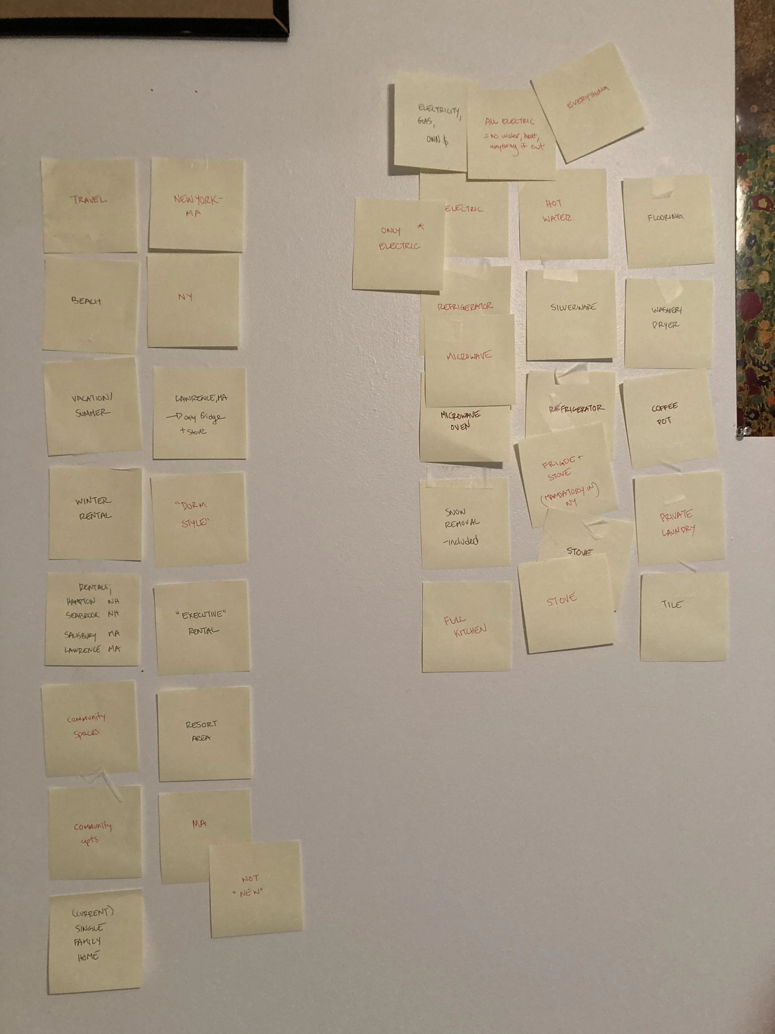
Affinity Map 3
The above shows the organized affinity board results. Different clusters each representing general categories such as amenity/essential, issue/resolution, timeframe/responsibility, etc. based on the interview notes.
In organizing the information another way via empathy mapping, my users' interviews and my notes of patterns therein could also be organized via header of the user’s user's feelings, actions and emotions, like so (below).
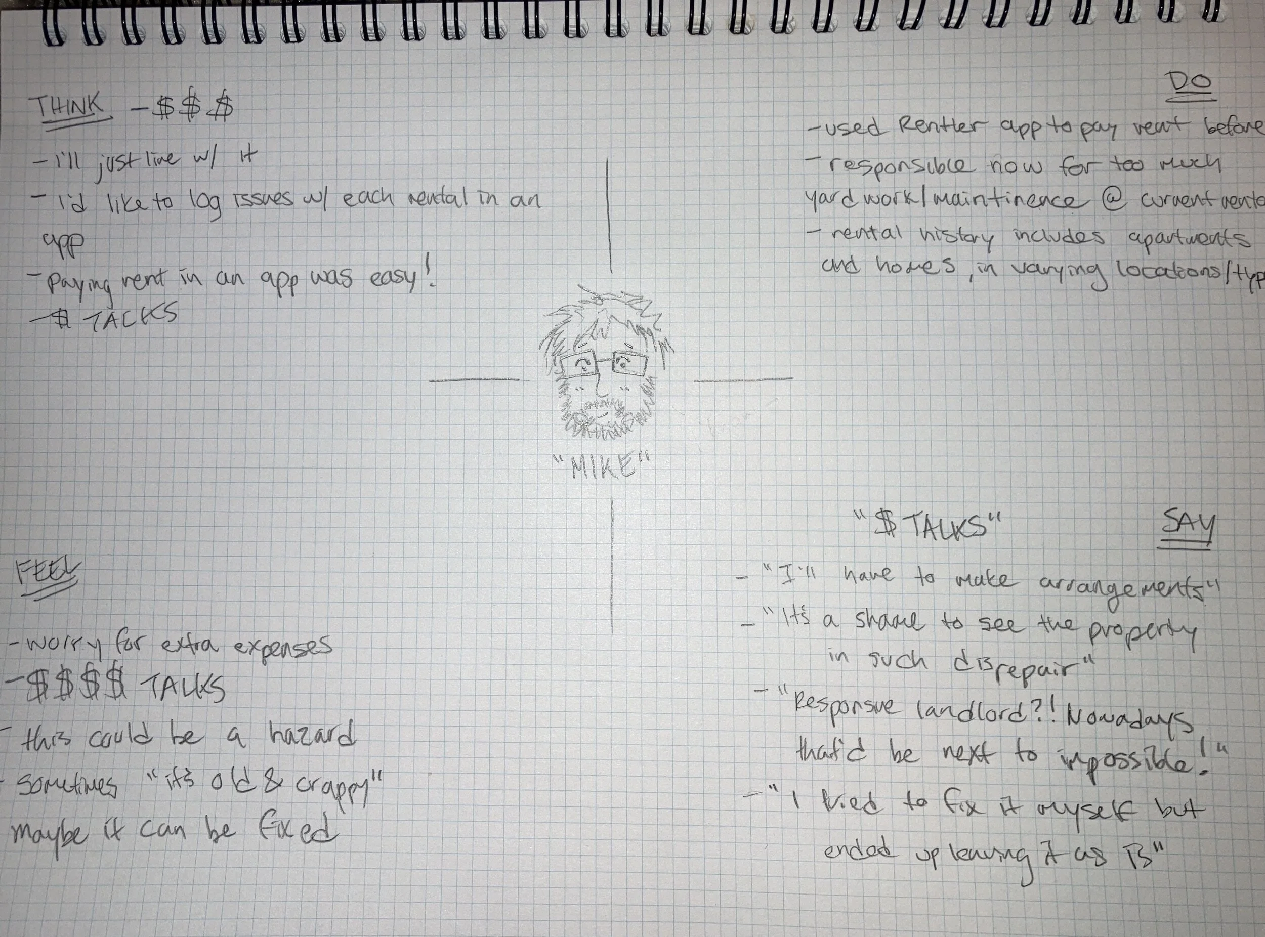
User “Mike” Empathy Map
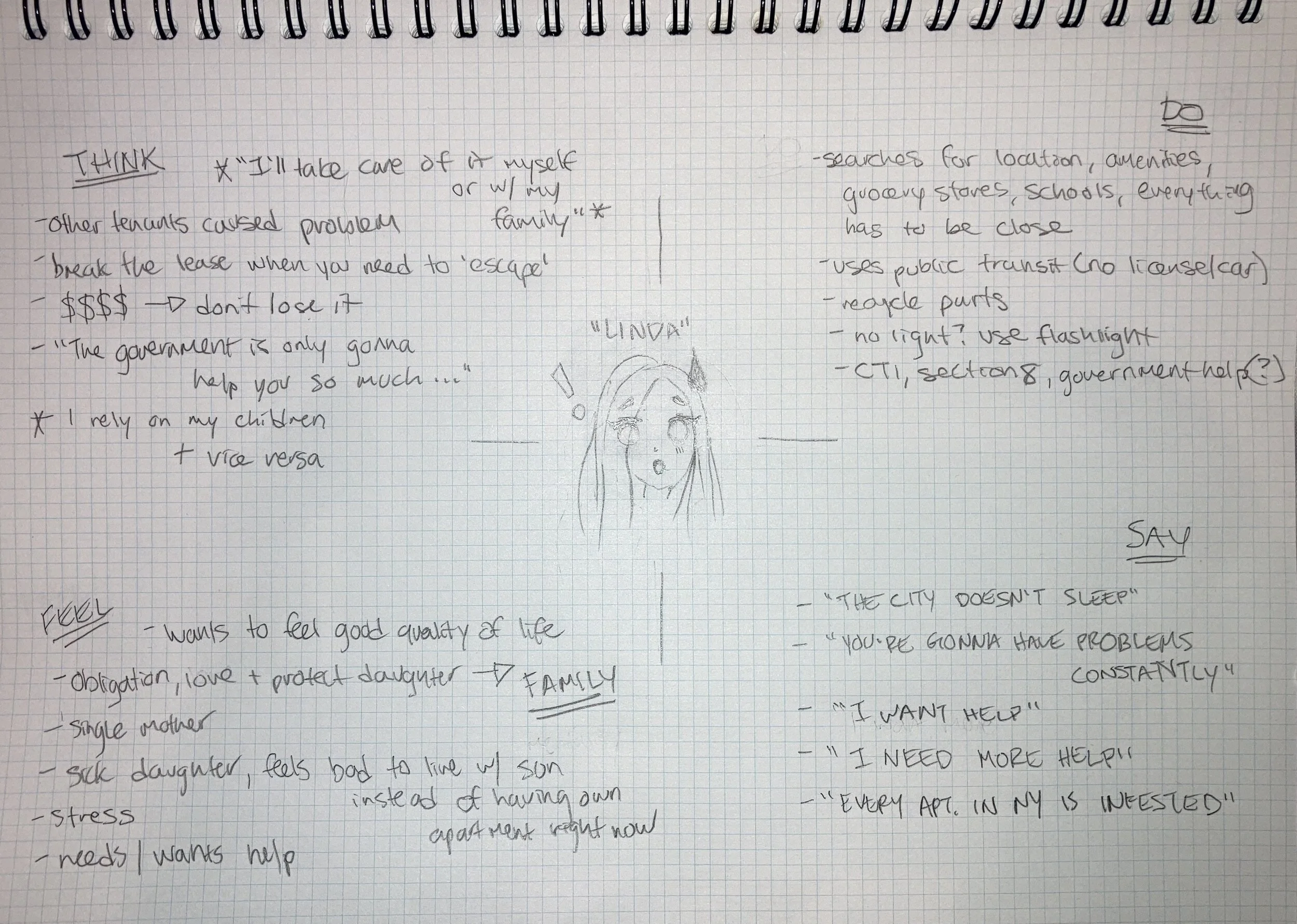
User “Linda” Empathy Map
Assumptions
I then made some assumptions here, moving forward, regarding user personas overall.
Each potential user affected by my idea and my design would be varied in age and experience in renting. Each potential user would have varied amounts of repair/maintenance experience. And of course, back to the beginning, it can also be assumed that people in general did not like to wait. People in general did not like to wait, especially for a repair and/or maintenance that affects the quality of their life. There is a standard of living expected in a renter’s agreement that should be kept (by law) but is not, particularly in greater metropolitan areas.
My idea was a design to move forward, as well as be a unique user experience at its forefront. The validation of this statement lies with its limited features, which are not simple conceptually (organizing work flows and legal document processes for all). The functionality and organization of my design will allow for a newfound synchronicity between all user types, and therefore improve and maintain quality of life standards.
My idea unites management and third parties affiliated with management already. Repair services would never be outsourced to a fourth party to organize and schedule. The functionality and synchronicity of my design lies within the contract, i.e. lease agreement, to the main user, the renter. The renter would remain the assumed client of the management team. The third party service would be on the same tier level as management to the renter user, and they along with management would be a client of “Rent Right” in a single legal agreement. This legal agreement would take place prior to acquiring any renters as users.
This legal agreement between Rent Right, and the management teams and their third party service companies, all would cohesively save all time and therefore money. And potential market impacts could increase overall sales for each party, for the sake of the positive benefit of the primary user, the renter, and their quality of life overall.
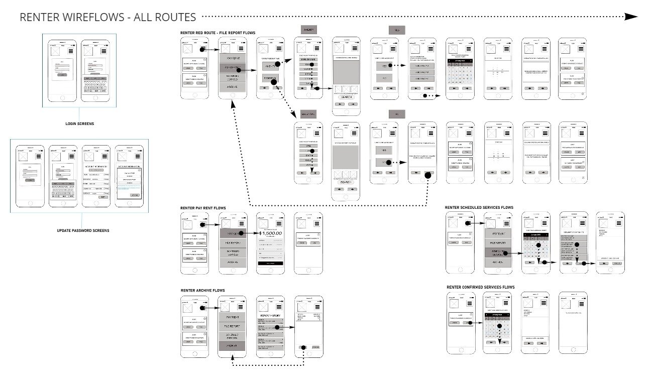
User Flows
At this stage, my main goal was to create a user flow for my idea as a product, with my users and their personas in mind.
My thought process was that in order to solve for the complexities of the whole, I needed to simplify. To begin, my sketches were the determined baseline the entire application would rest upon. And it needed to carry the weight by design.
According to additional research here, the management/owner of the property faces several legal issues around amenities and essentials if not kept as per the renter/lease agreement. And according to my own research from renter’s, there are far more unresponsive and disagreeable owners/landlords/management teams than not.
So, with my application being different from the competition in that my design is a tenant-focused application while others are landlord-focused, I proceeded to the sketch stage with the renter’s user flow to determine before all other user types. (see below).
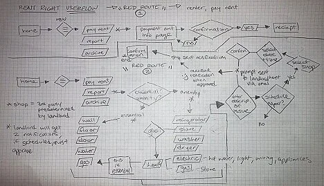
Sketched version of initial thought of user flows.
After sketching, I was ready for digital.
So I moved to my favorite application at the moment, Miro, to validate my initial thought process in the design’s foundation.
Sketch>digital iteration>measure success was my hope at this point.
I determined the foundation for the renter-focused app in Miro here.
(Contact me via jakkicushi@gmail.com for the password to enter).
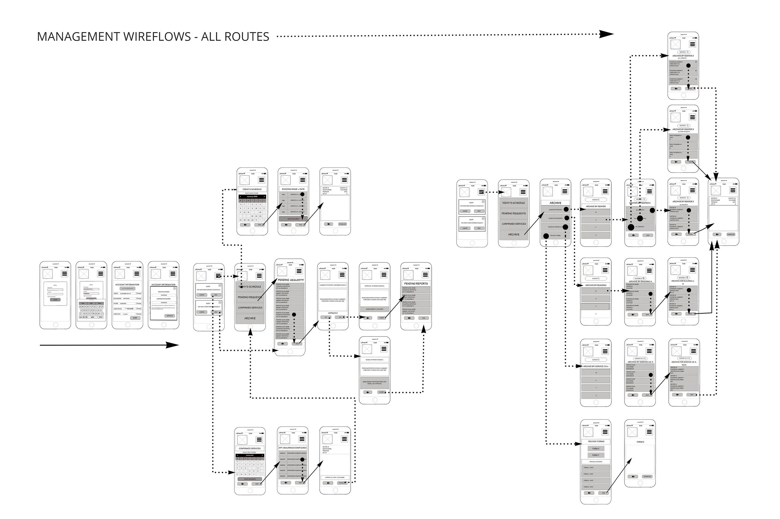
And since I had my primary user’s user flows determined baseline, management/third party were then determined (below) as a singular flow, i.e. the second tier of my initial thinking.
Above shows the user flows of both management as well as third parties as a single user type. My thought process was that these two would be the second tier, while the renters were the primary tier, as within my initial thought/design processes above.
*I was aware that at this checkpoint, that there may be elements missing in my overall design. However, it was best practice to focus once again on my primary user, i.e. the renter user.
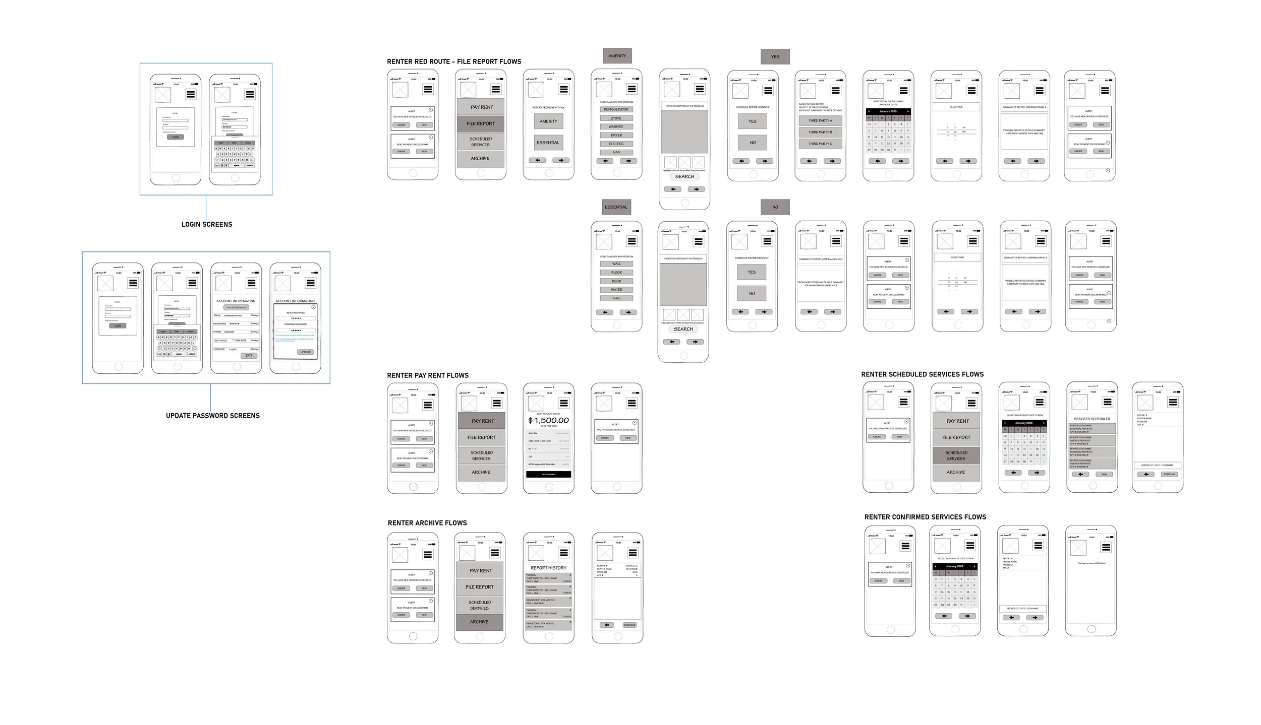
Wireframing (Validating Sketches)
So I decided to go back to sketches here.
To my “art school brain,” I always started with a sketch, a complete plan.
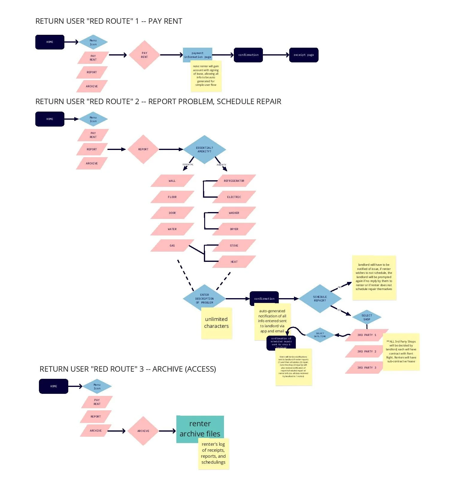
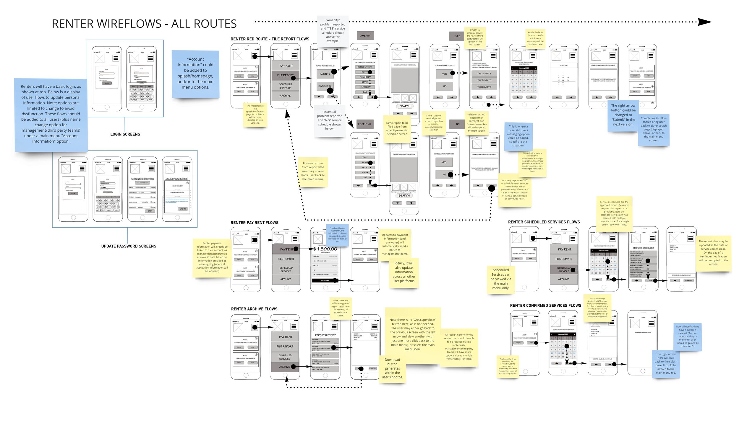
And since wireframing is far more involved in digital form than in my notebook, to save time and efforts later, I re-focused on my primary user, my renter, and sketched out my user flows into wire flows (as shown below).

Initial sketches were scanned and organized digitally above.
Now that I had these screens as a foundation, I wanted to stop and validate my design.
I used the MarvelApp to prototype a preliminary version of my conceptual design idea.
Guerilla Usability Testing (Validating)
I took my scans (as organized above in Photoshop) a step further before getting into the next stage of digital wireframing. I uploaded each of my screens thus far into the MarvelApp for a preliminary testing of what would be the baseline of my prototype. I wanted to validate my design thus far, and check my design thinking again to see if there was anything missing, like a screen, button--anything missing in the design thus far, essentially. I needed to validate my idea before I pushed it further in digital development.
Methodology: Guerilla Testing involves a selection of random users being asked to complete (usually) about 3 tasks within the prototype.
After using the MarvelApp to prototype my initial, literal sketches, and being unsatisfied with programming, I made note to try prototyping in my preferred application of Adobe XD in future high-fidelity iterations, but also of a commonplace industry standard, InVision. Figma is another industry standard like InVision, and so I wanted to include these despite my personal preferences.
Participants: Colleagues, Friends and Skype contacts; approximately 6 total.
I tested three red routes of the app with this sketch stage. Sign Up, Report Problem and Schedule Repair were the tasks they were requested to complete here.
The goal of this testing session was to note the user’s pain points as they completed each task. These would then be used in the updates to come to my prototype.
Usability Testing Results:
Though the MarvelApp is not perfect (which was ideally anticipated), it served its purpose to validate my design thus far.
Users did not have too many issues with the simplified design and user flow mapped out. Users had difficulty in what seemed to be glitches in the MarvelApp’s use. I concluded this was likely due to link sharing across varied device types, at varied locations throughout the US.
After adding some notes to my screens for later, and adding a screen or two for overall functionality, the clickable sketch prototype in the MarvelApp can be viewed and tested here.
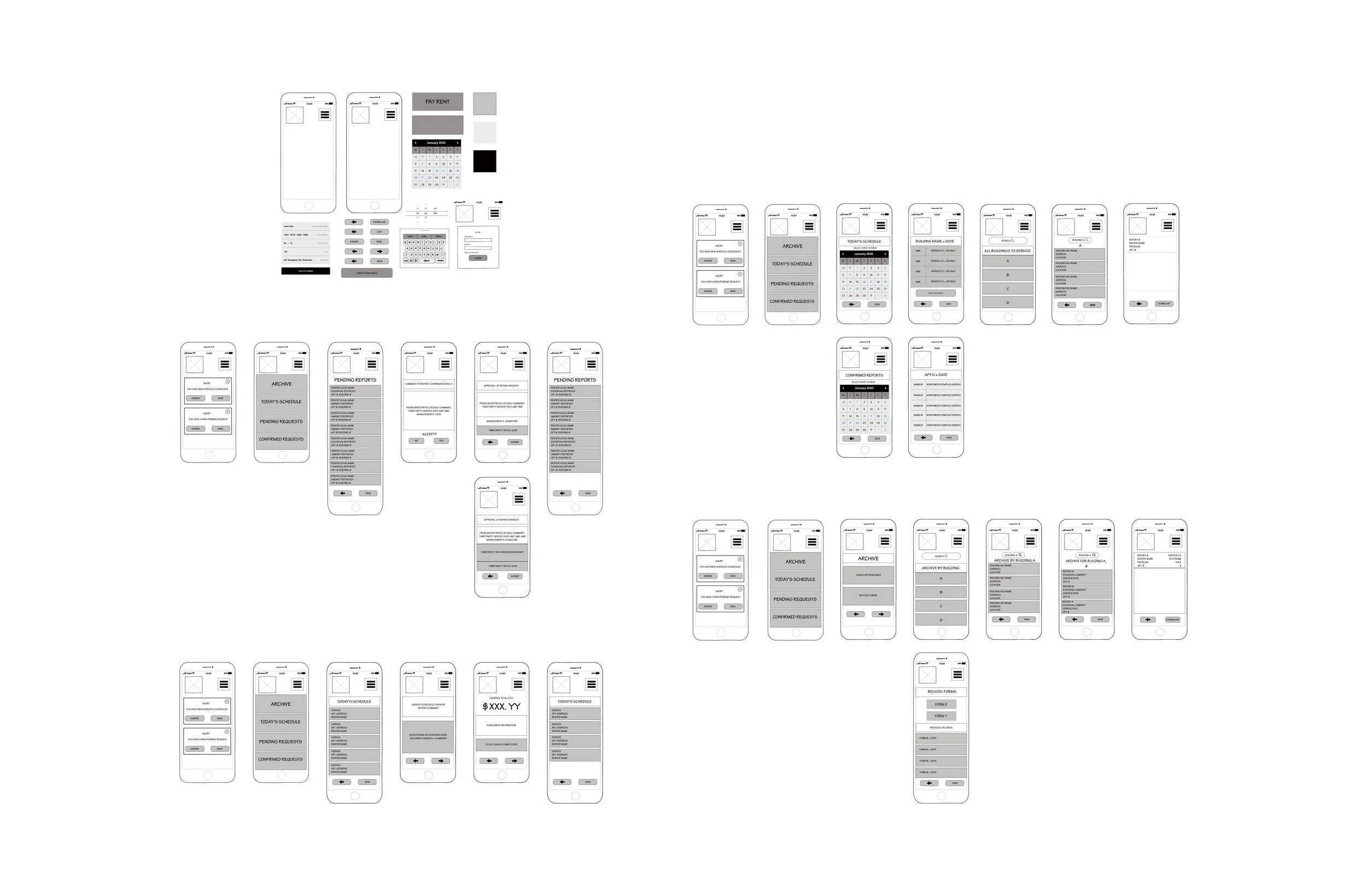
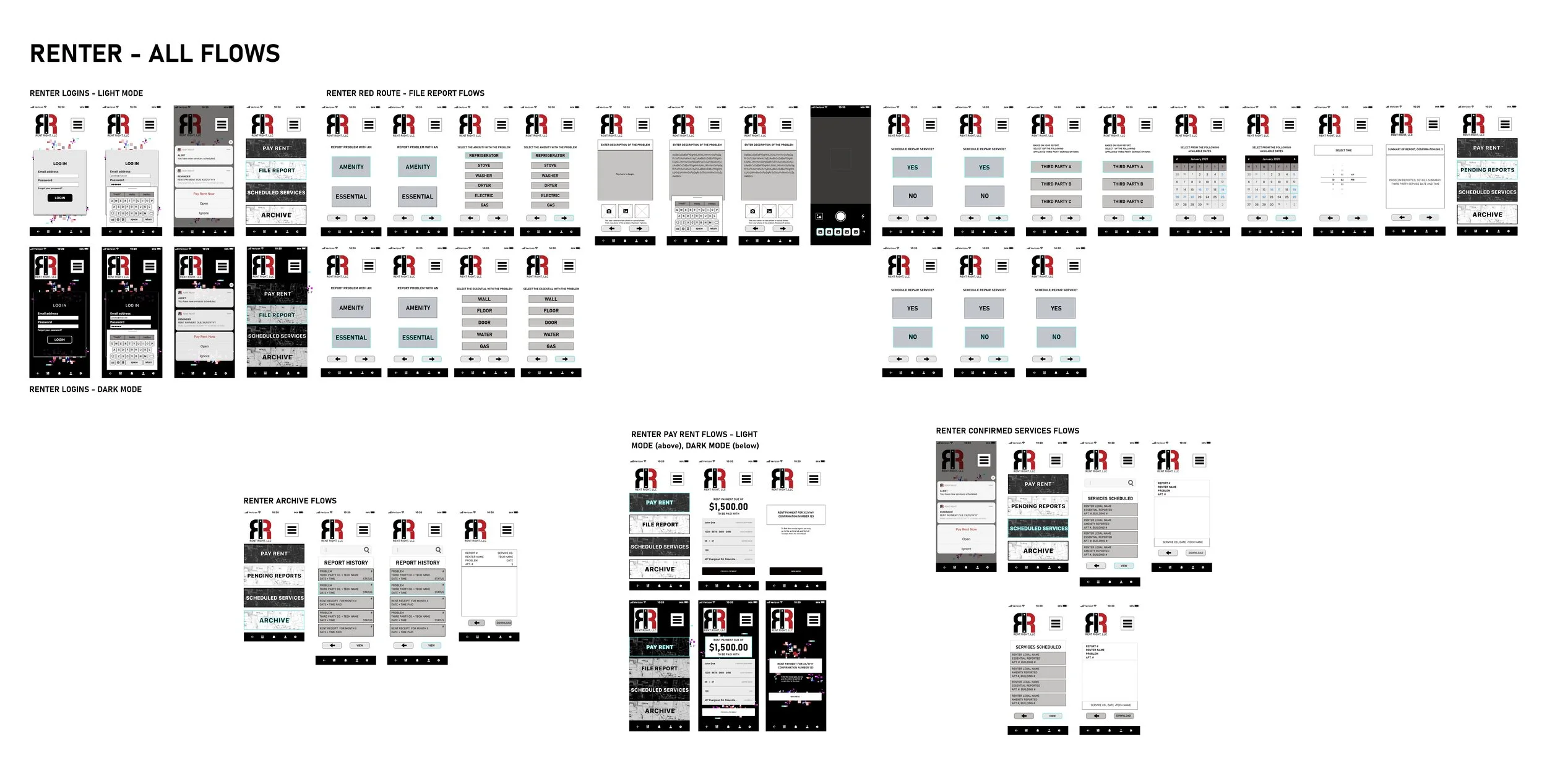
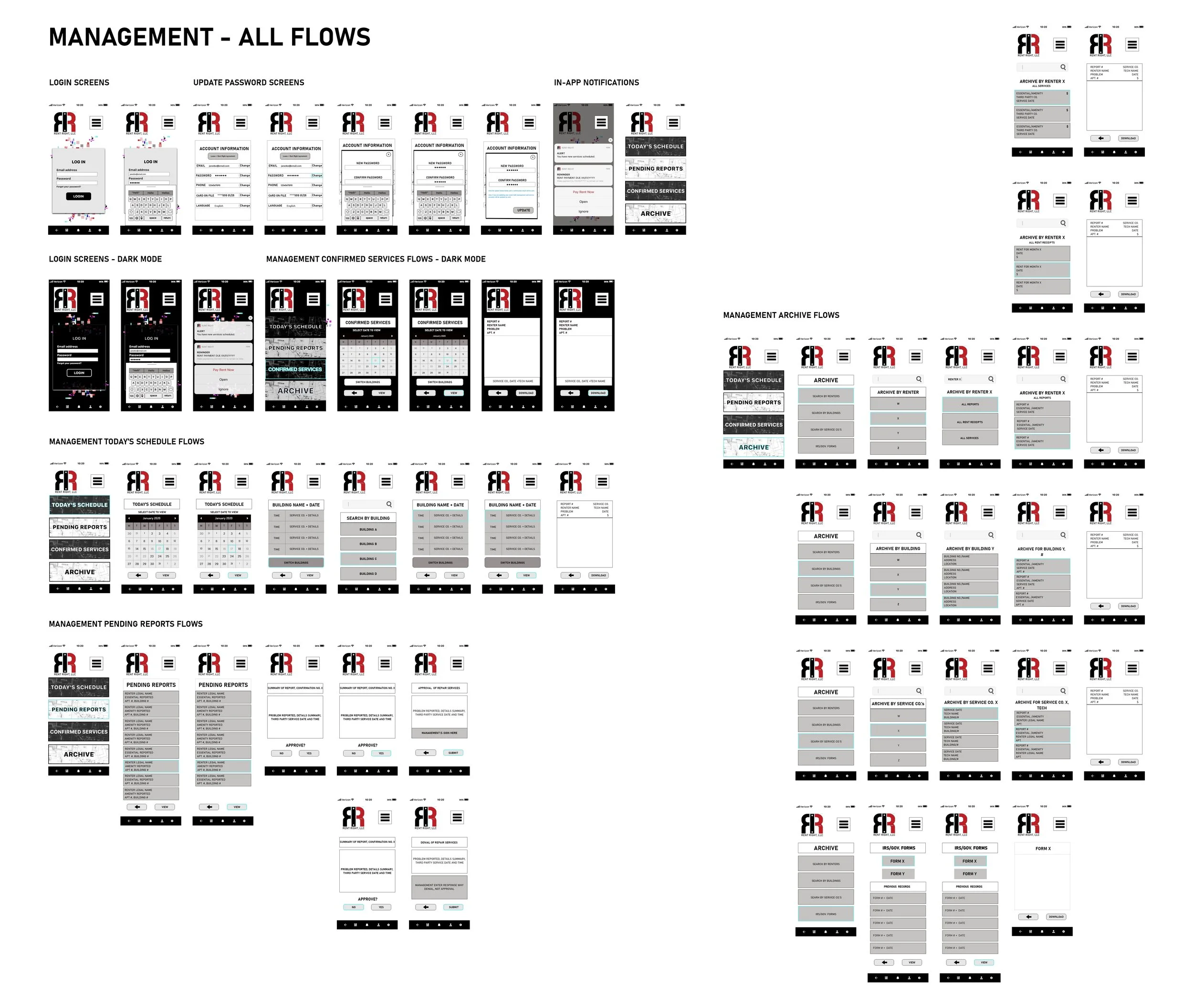
Wireframing
Now that I had my design thinking thus far affirmed/validated, I could proceed further forward. I recreated my sketched out screens into digital iterations via Adobe XD.
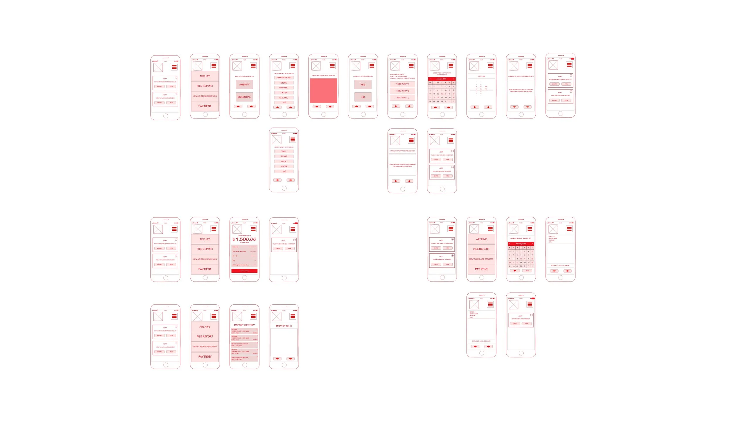
Above shows the first digital wireframe iteration of my user flows.
(To view the high-fidelity iterations, continue and view below.)
As I was acting in so many roles for this project, including lead/director (and also in having upheld leadership roles in design and otherwise before) I went back to my default setting of ‘red pen.’
However, in understanding a potential taboo, for presentation purposes, I re-worked in greyscale, making my own design system for future projects as well.
Below shows the second digital wireframes as created in Adobe XD, with the color change I required to avoid any taboo/misinterpretations.
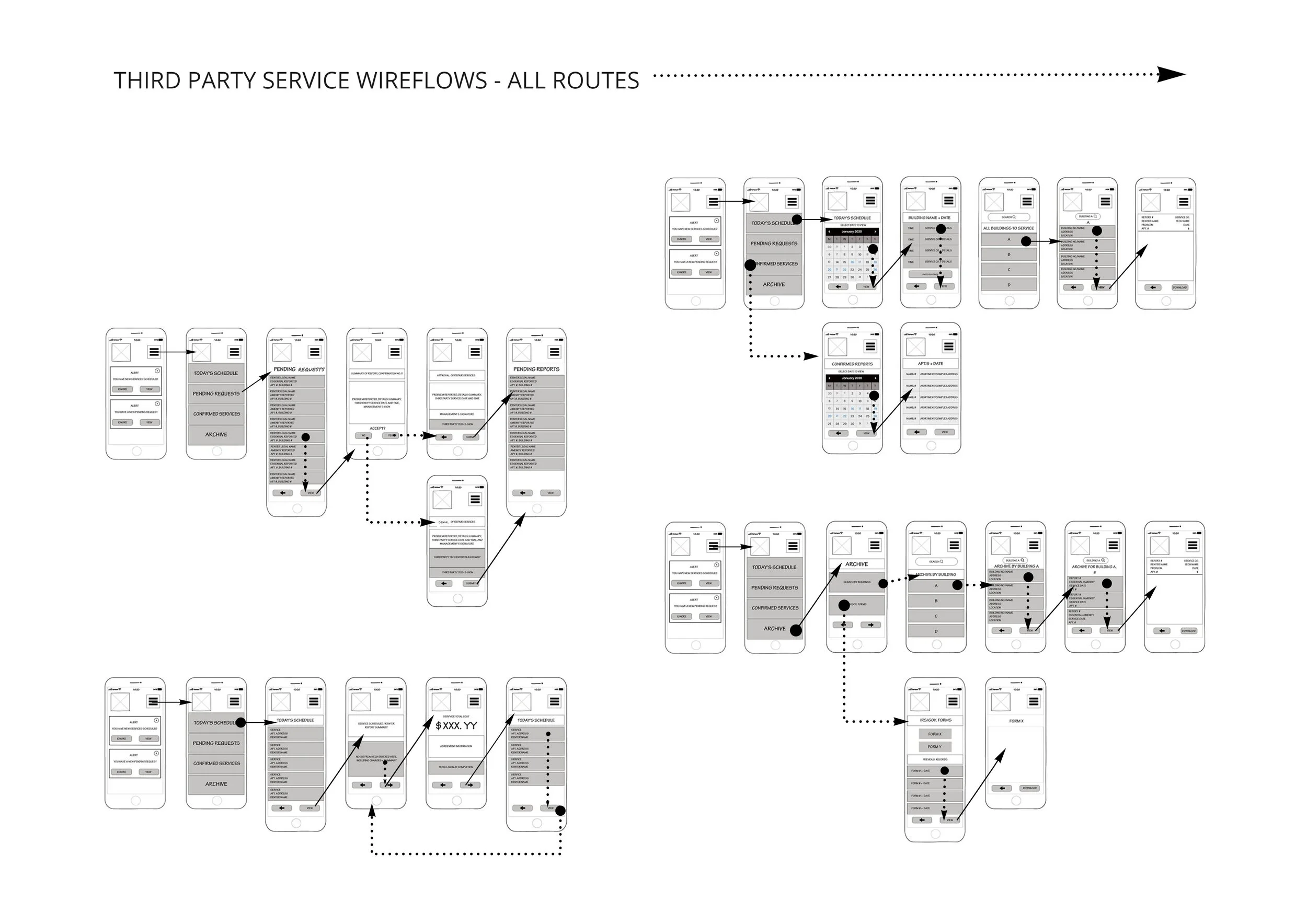
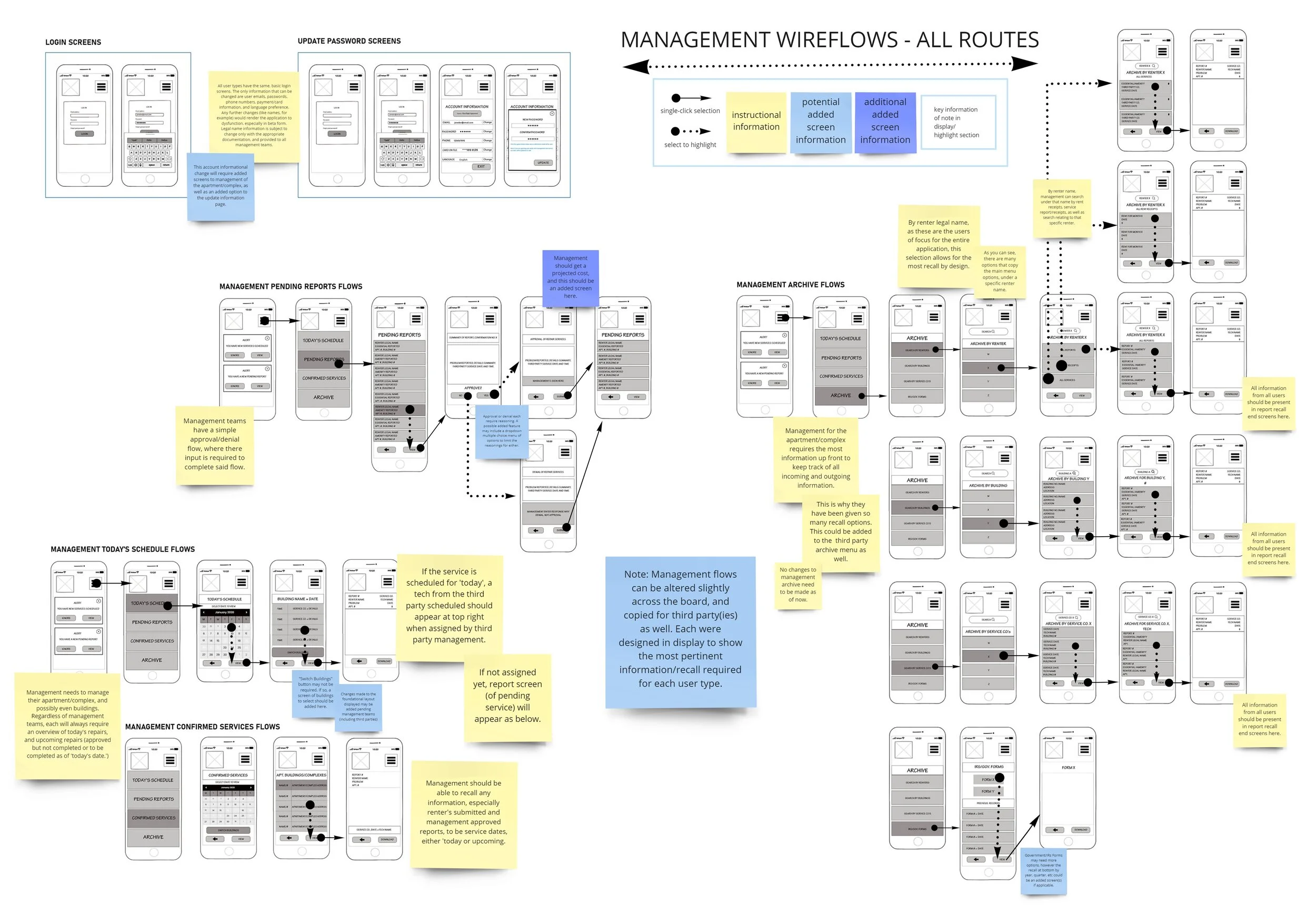
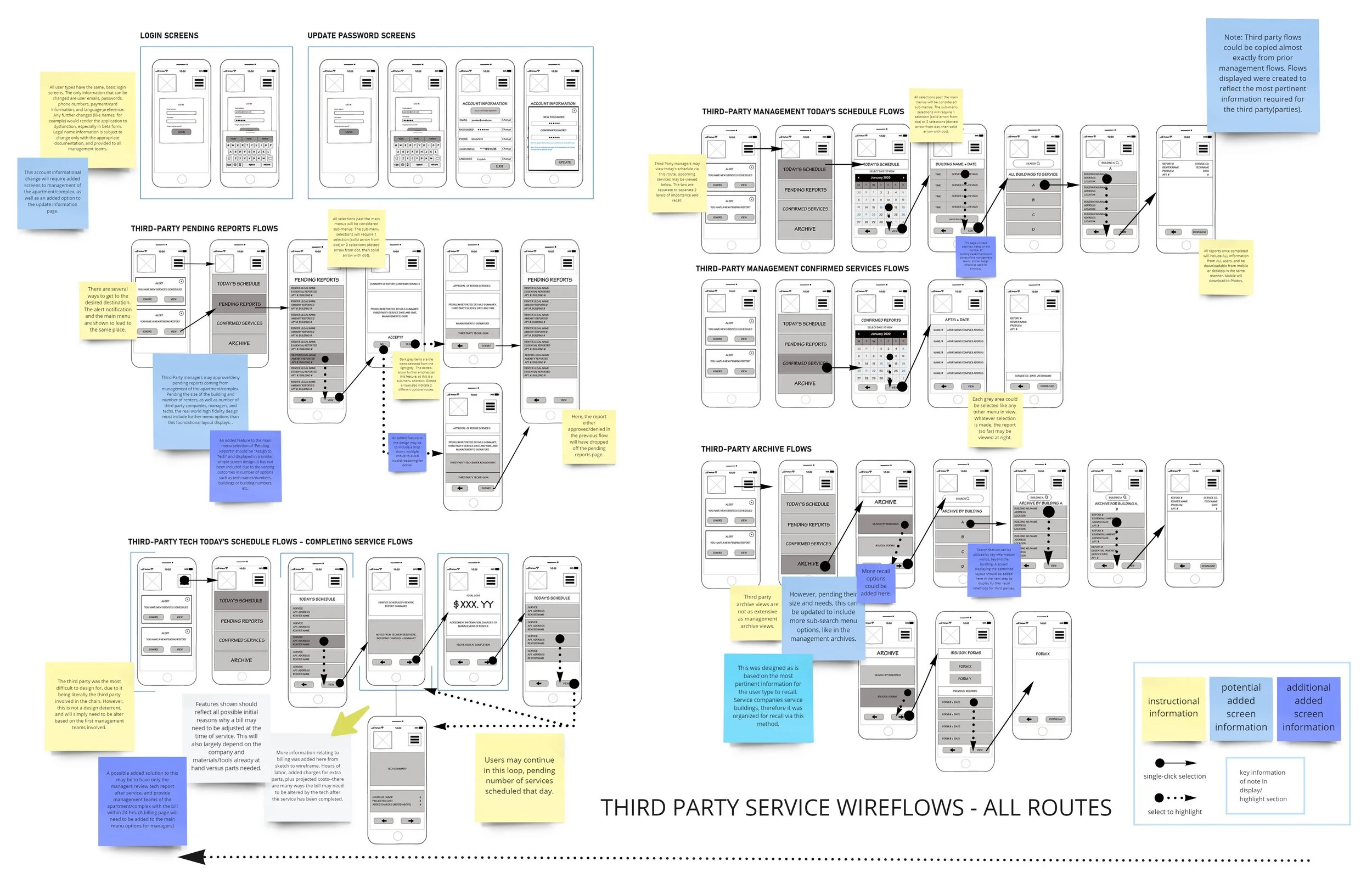
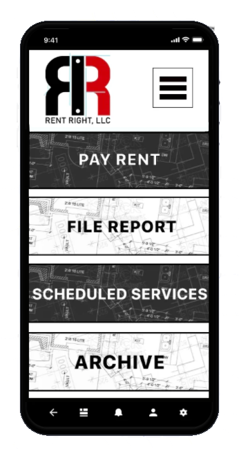
After creating the renter wireframes/flows above, it was here that I realized that in setting the base for my renter-user-type, it made sense to separate my management and third party user types.
The base of the renter included paying rent, and filing reports, as well as archive-recall for receipts of either repairs scheduled at the end of said reports, or invoices from paying rent each month.
Since management required the ability to view renter requests, then approve/deny said requests, the interface at the main menu had to be changed already here. This was the initial point of separation from third party user types, as third parties would be assumed to take all requests sent by management. This connected management to third parties, however, management remained Rent Right’s main client.
My initial design expanded exponentially by comparison to my sketch.
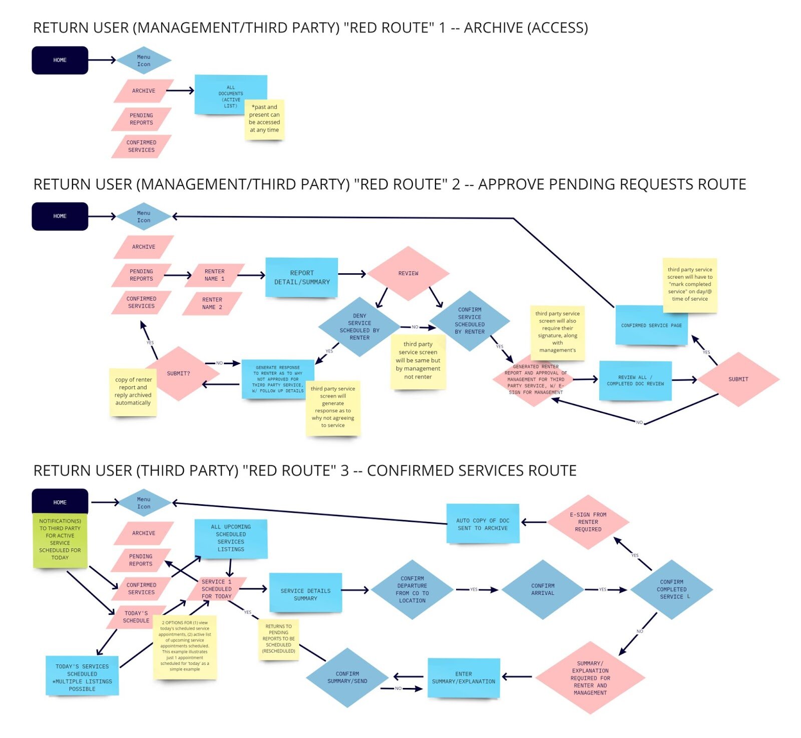
To ensure overall functionality for each user type, the wireframes of both management and third parties were made in separate files. This allowed me as a designer to work through each user type>unique user flow/function>develop specifics further.
The management user and third party user wireframes are shown below.
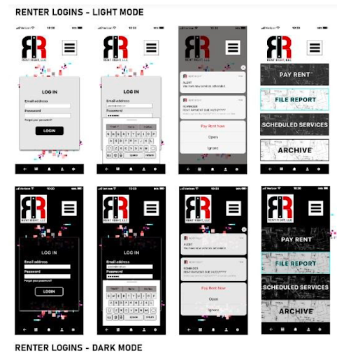
With the in-between frames now added, it made sense to begin developing the supplementary ‘in-betweens,’ here too, such as login and additional account settings pages. By deciding here to make all logins the same for each user type, it also made sense to use the renter design and carry it over to the manager/landlord as well as the third party service companies. This would allow the entire application to retain a uniform design, and reinforce the simplicity aspect I’d set out for.
So I created wire flows for management and third party service companies, taking screens from the renter flows, and adjusting as needed.
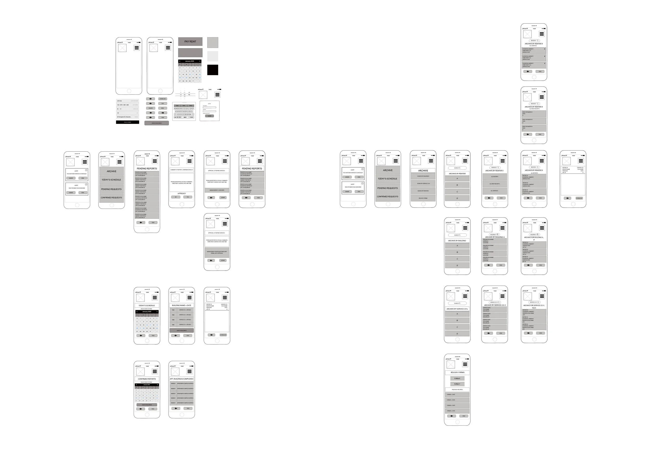
Each user type required the addition here of unique notification screens, login screens, and alert screens.
My design thinking at this point was simply to develop a base for each user type, then when each were complete, repeat the process and work through all potential ‘clicks’ and add to each as needed.
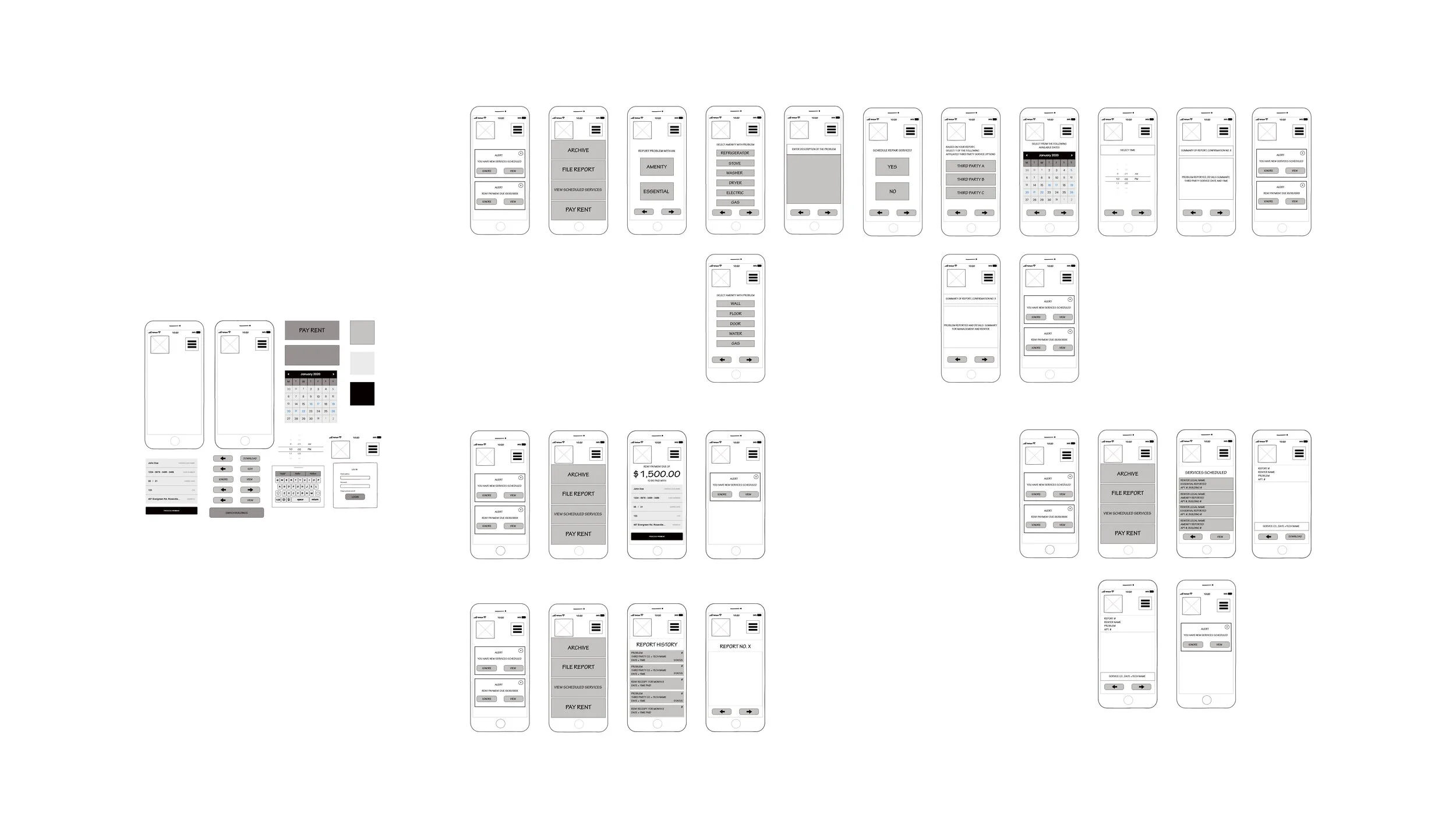
EDGE CASES
With the wireframe bases developed, I created what are referred to as ‘edge cases’ to start this design thinking process of possible corrections here. (shown below)
I had the beginning, base/foundational user flows, and an end designed into said user flows. But before things got too complex in high-fidelity iterations (later), I needed to re-evaluate my thought processes at this checkpoint.
Edge cases (as previously mentioned) are scenarios of possible critical issues for varied user types not yet considered in the idea/design overall. In other words, what circumstances here could generate an issue of usability in my design right now?
This checkpoint is essential for all UX/UI designers.
By this stage, a lot of thought and effort have already been put into an idea, into a design, coming to fruition. And so some details may have been overlooked or missed already (we are all human). To avoid critical issues, etc that could result from that factor, it is of high-value to take a moment to ask a series of questions and resolve/answer them now, rather than at any other later stage in the design process.
I asked myself here;
Does this make sense? (user flows, screens, instructions, buttons, etc)
If you have the renter user flows sorted as the primary user, can the management as well as third party user flows now be sorted out?
What would management ask for clarification on here if this were a whiteboard session?
What would engineering and development question further here?
Did I know the answers to everything at this time?
What needs to be added, adjusted, thought out further?
As a designer, I know that I do not always have the answers to everything at any given time. The questions I began with above to address what was missing in my design at this checkpoint related to language settings needing to be changed, and images needing to be included to provide clarification of the reported problem to any user type.
You can view these in Miro as well, with the password. Contact via jakkicushi@gmail.com for more information.
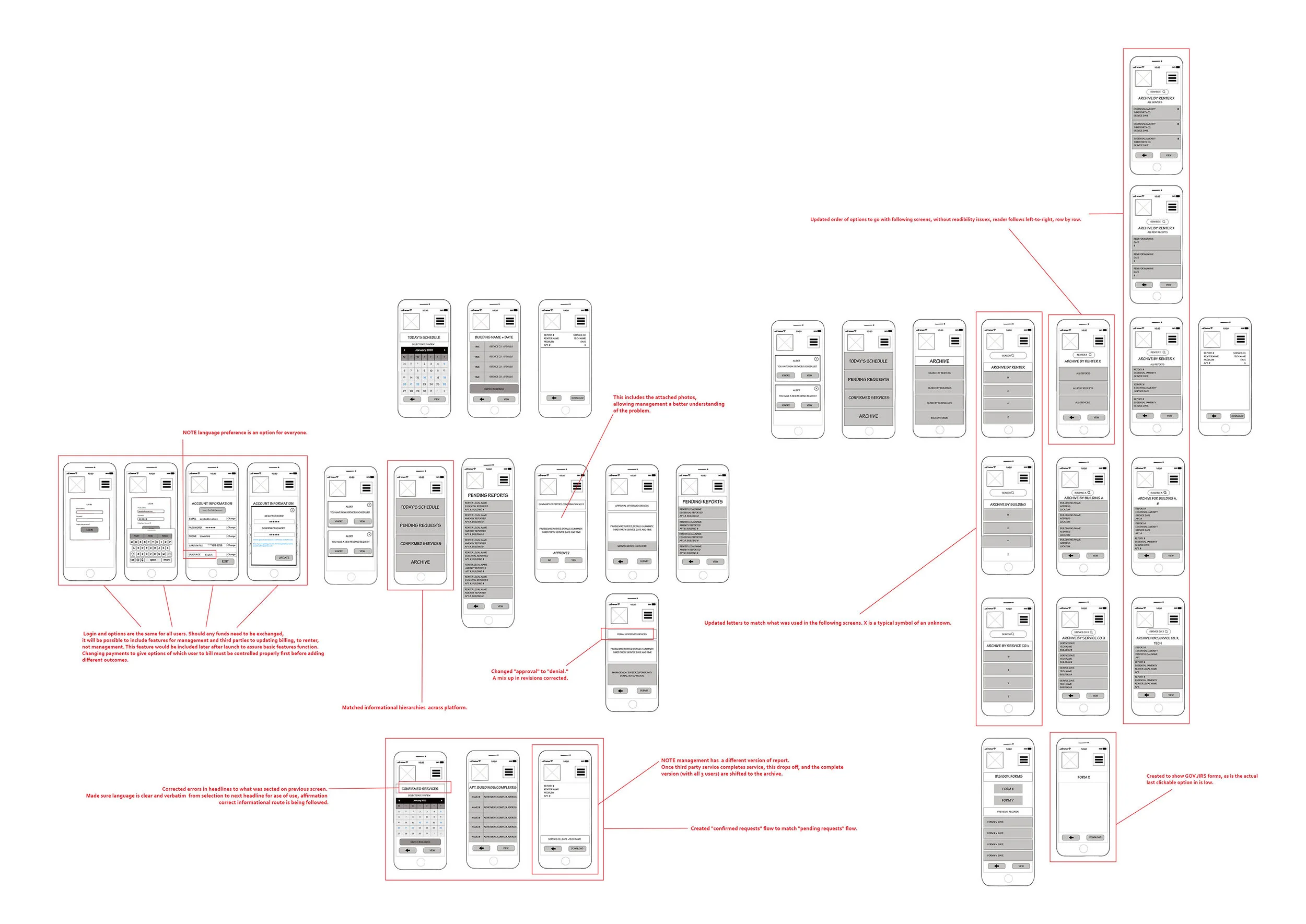

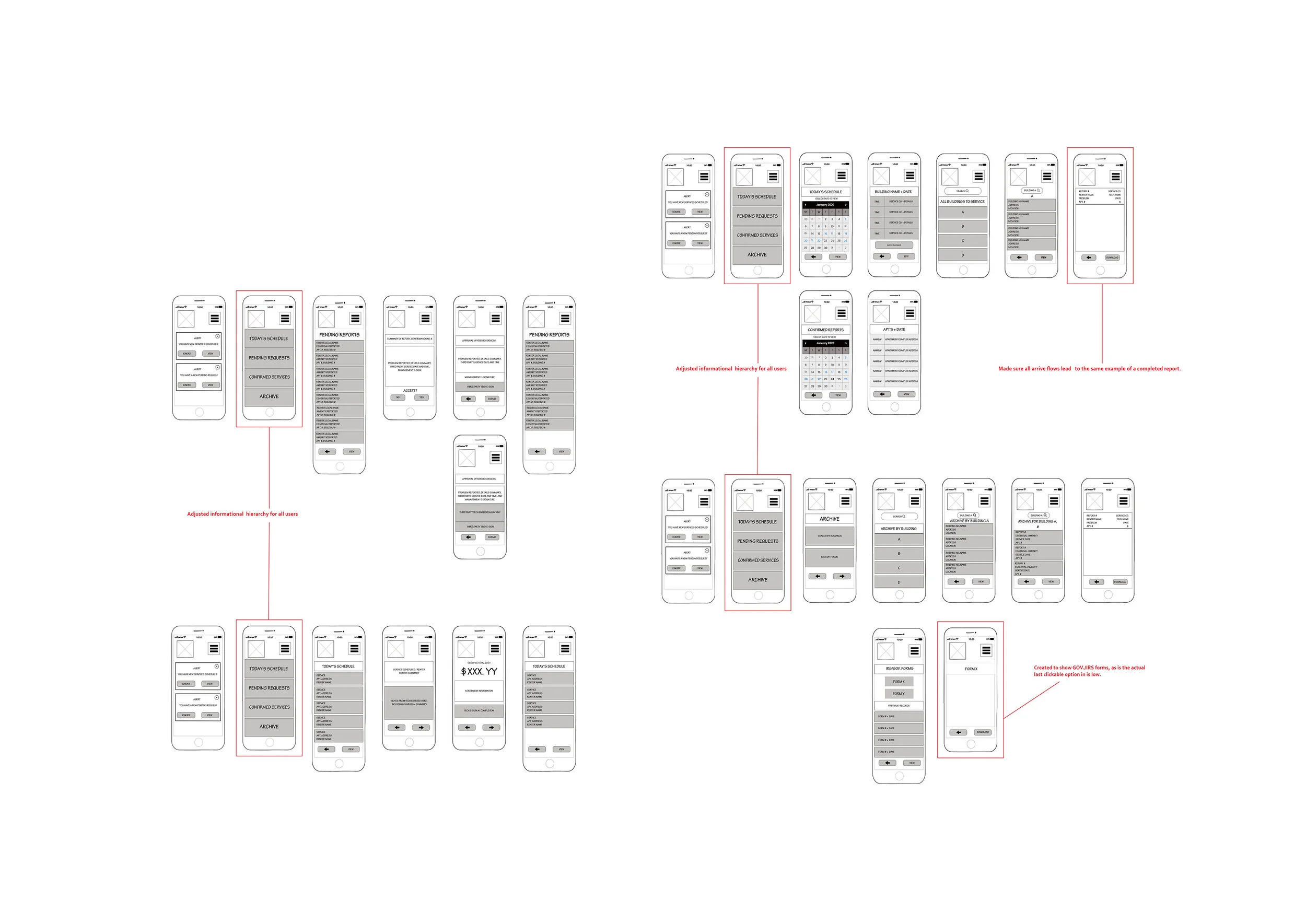
Below shows the updates from the case studies now included,
as well as notes, both in general (in blue), and to management/developers, etc., (yellow).
A link to the Miro file of the stages/images above can be viewed here.
Note it is password encrypted and a password from me will be required in order to gain access.
Please email at jakkicushi@gmail.com for more information, and the password.
Visual Design : Part 1, Design Systems
For this design to truly come to life in the high-fidelity stage, one more step must be considered and compiled here; the brand that defines said design idea.
I stopped here to consider and create a design system for reference in high-fidelity design.
Design Systems include the design/idea’s branding, in general.
Below is the brand summary for this design idea.
BRAND PLATFORM
Company/Product Name: Rent Right
Name
Rationale: Explain why you chose this company name.
I came up with this name because as things are now (without this application), it does not seem right. There has to be an easier way to rent, and manage issues therein, hence this name.
Mission/Vision:
Mission/vision (2-3 sentences)
Rationale: Explain why you chose this mission/vision.
Rent Right’s mission is to link renters to management teams of the apartment they live in, as well as to the third party repair services they may need to hire for repairs.
Rent Right allows renters to report issues with amenities or essentials (like water, for example) directly to management in detail, and gives them the option to schedule a repair service right then and there.
Rent Right seeks to give the renters the power to address and resolve issues with quality of life as a renter, all within the legal agreements of the apartment, as the terms of service is designed to be a part of their lease.
Brand Personality:
Statement of brand personality
Rationale: Explain why you chose this brand personality.
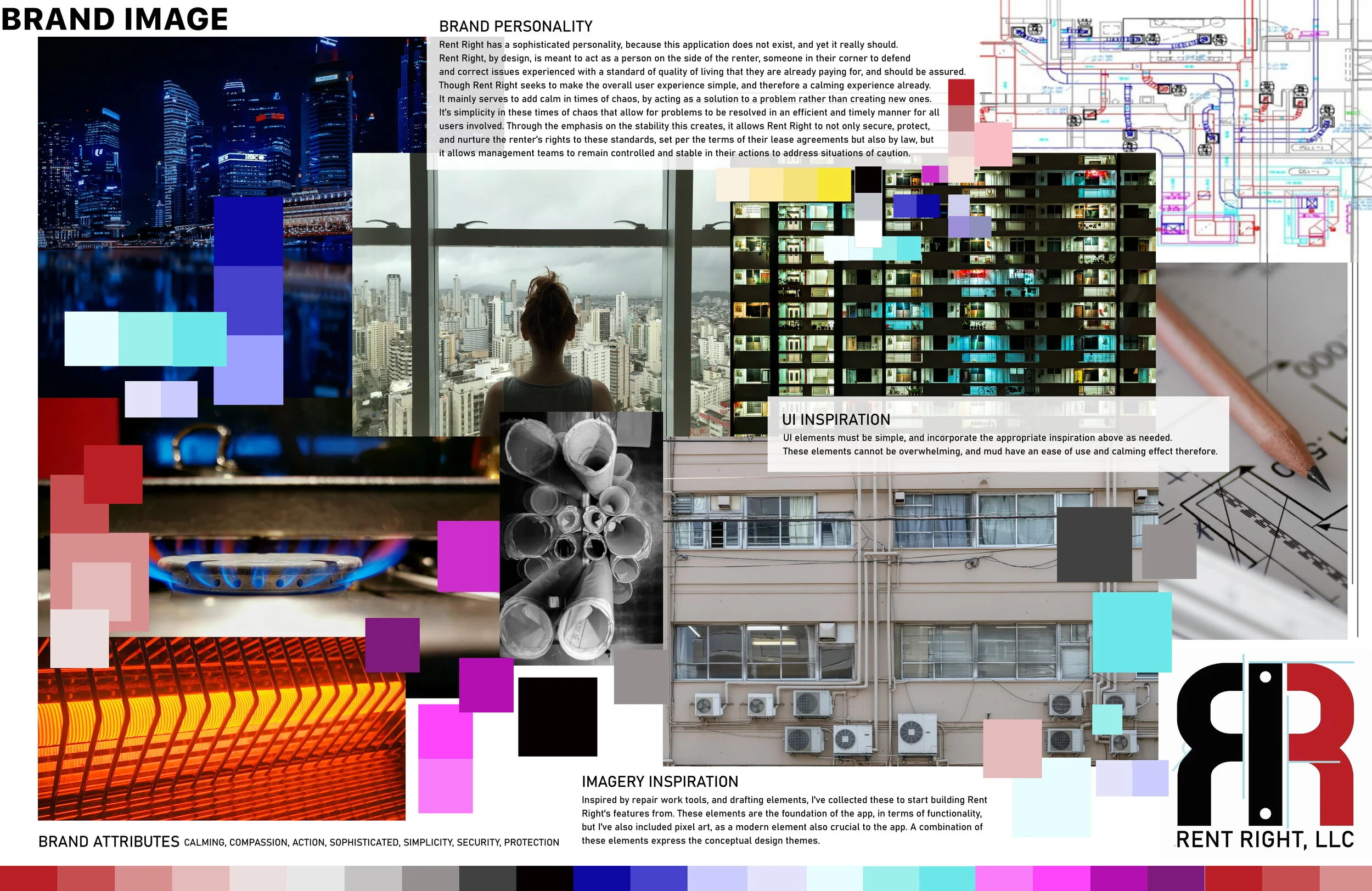
Rent Right has a sophisticated personality, because this application does not exist, and yet it really should. Rent Right, by design, is meant to act as a person on the side of the renter, someone in their corner to defend and correct issues experienced with a standard of quality of living that they are already paying for, and should be assured.
Though Rent Right seeks to make the overall user experience simple, and therefore a calming experience already. It mainly serves to add calm in times of chaos, by acting as a solution to a problem rather than creating new ones. It’s simplicity in these times of chaos that allow for problems to be resolved in an efficient and timely manner for all users involved. Through the emphasis on the stability this creates, it allows Rent Right to not only secure, protect, and nurture the renter’s rights to these standards, set per the terms of their lease agreements but also by law, but it allows management teams to remain controlled and stable in their actions to address situations of caution.
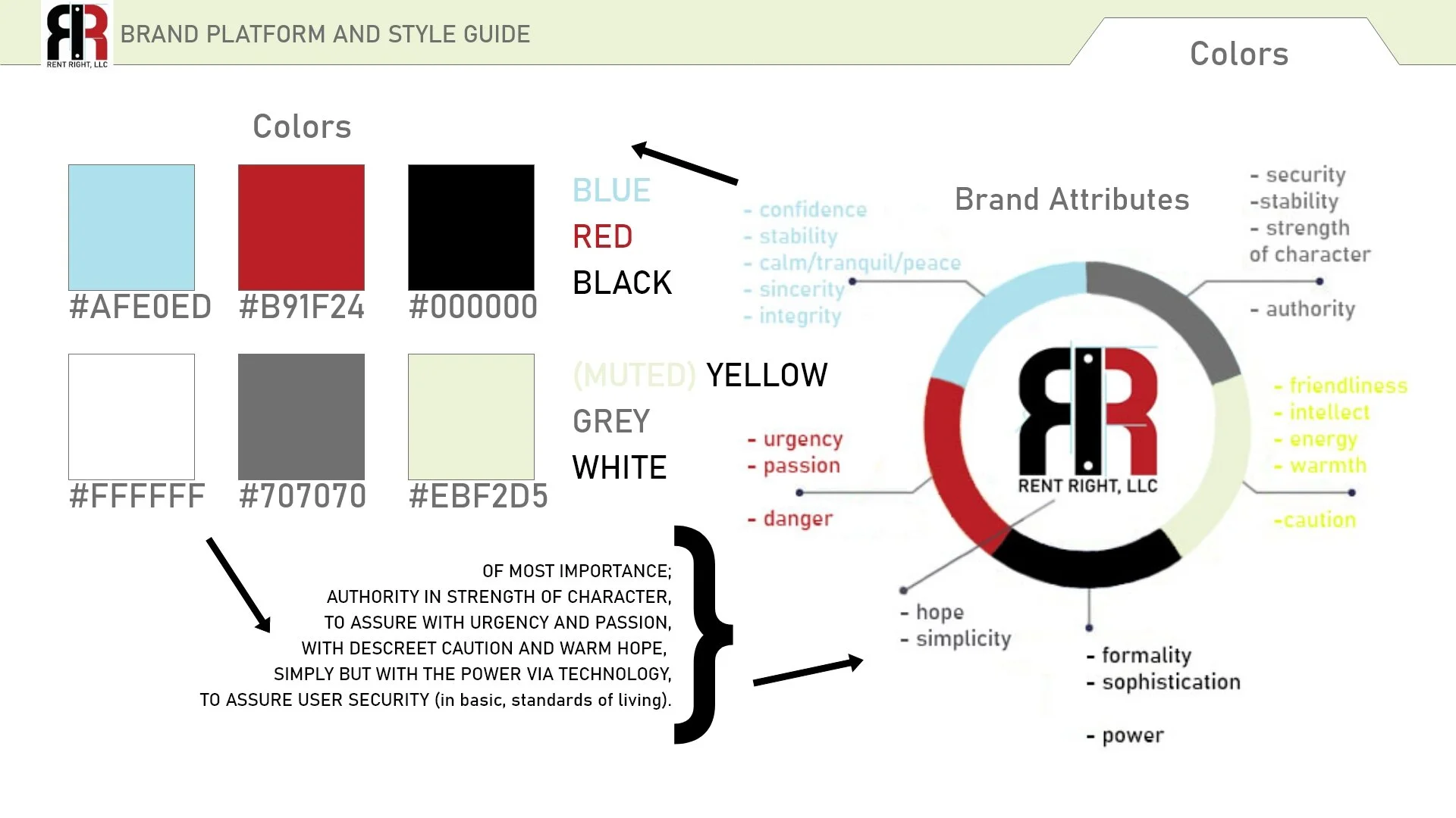
Brand Attributes
Brand attributes (4-5 adjectives)
Rationale: Explain why you chose these brand attributes.
Rent Right is
Simple for all user types in design; also simplifies a lot of information to resolve issues of caution in a quicker manner than without, which therefore offers controlled stability with problems that should be handled appropriately and with caution
It is sophisticated as nothing quite like it exists but it should
Calming and controlled in chaos
Offers human compassion over all else by design, and provides a path to solutions to problems, by designing to eliminate problems, and ensure a standard of living that is not quite luxury, but essential. Therefore, it is a luxury all its own.
Now that the brand has been established, conceptually, next, is creating a style guide.
(continue below).
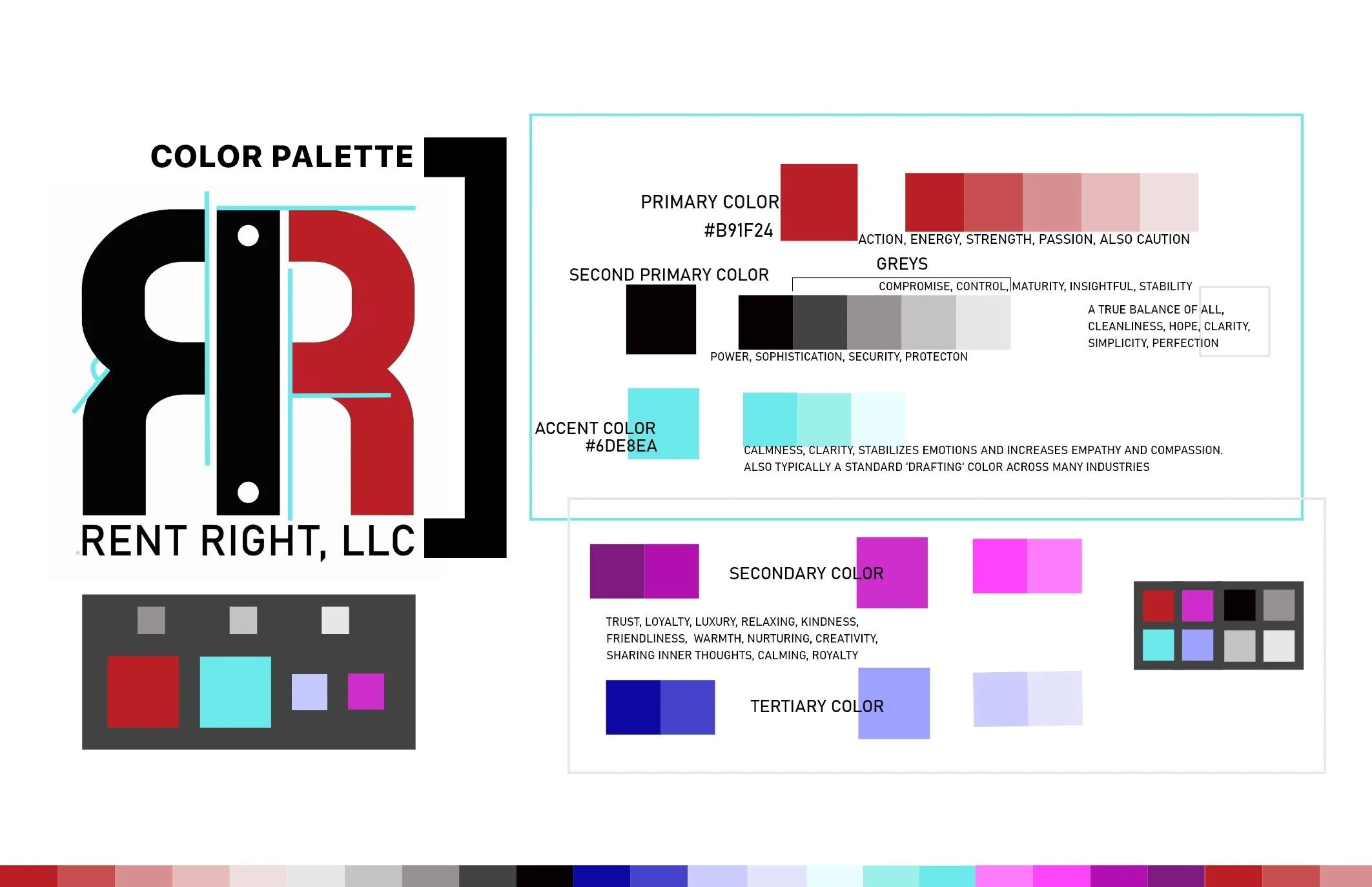
The style guide is where the color palette, logo, etc. are literally generated.
Visual Design:
Part 2, Style Guides
I created an initial version of the style guide below.
In summary, this included:
Mission/Vision statements
Brand attributes
Brand ‘personality’
Logo
Icons and sizes for varied platforms
Color palette (and reasoning)
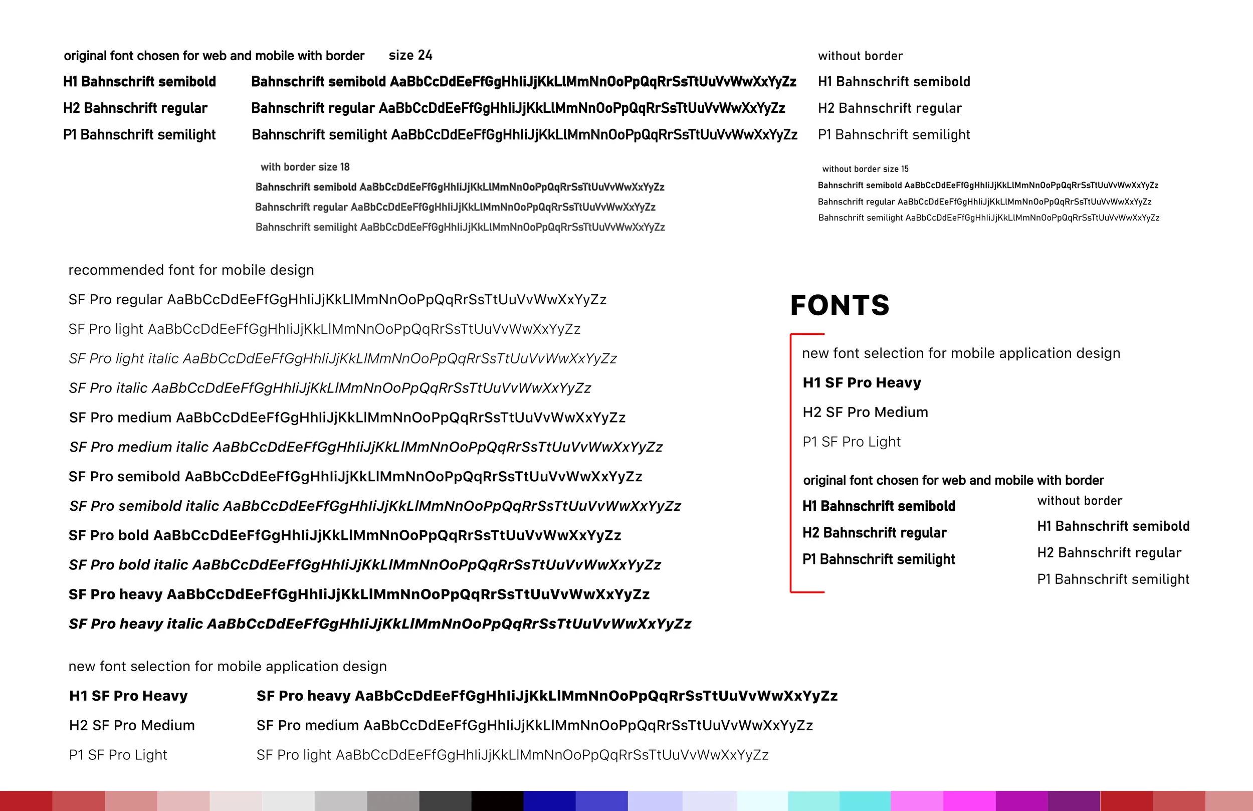
Fonts
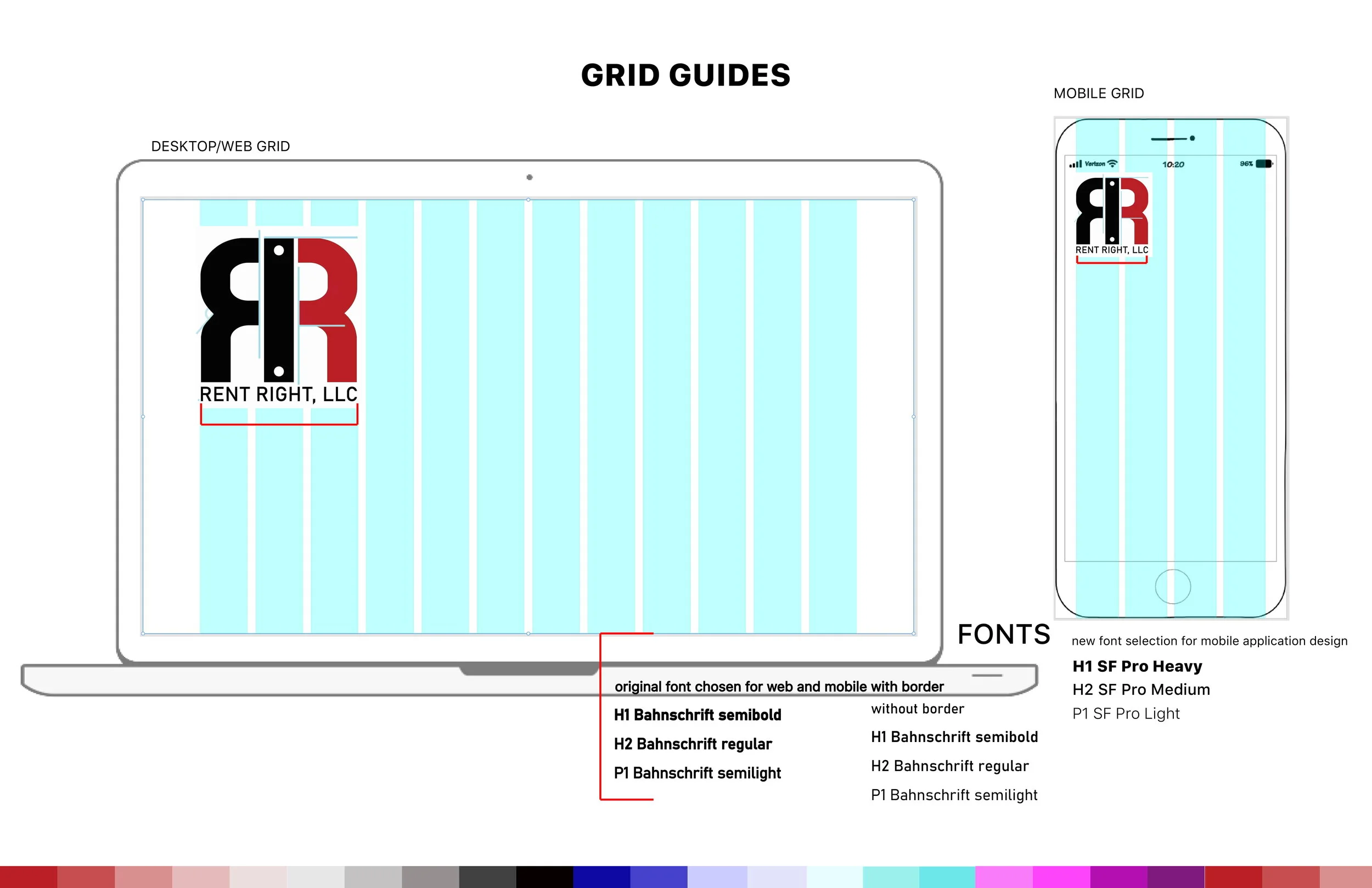
(optional) Grid systems
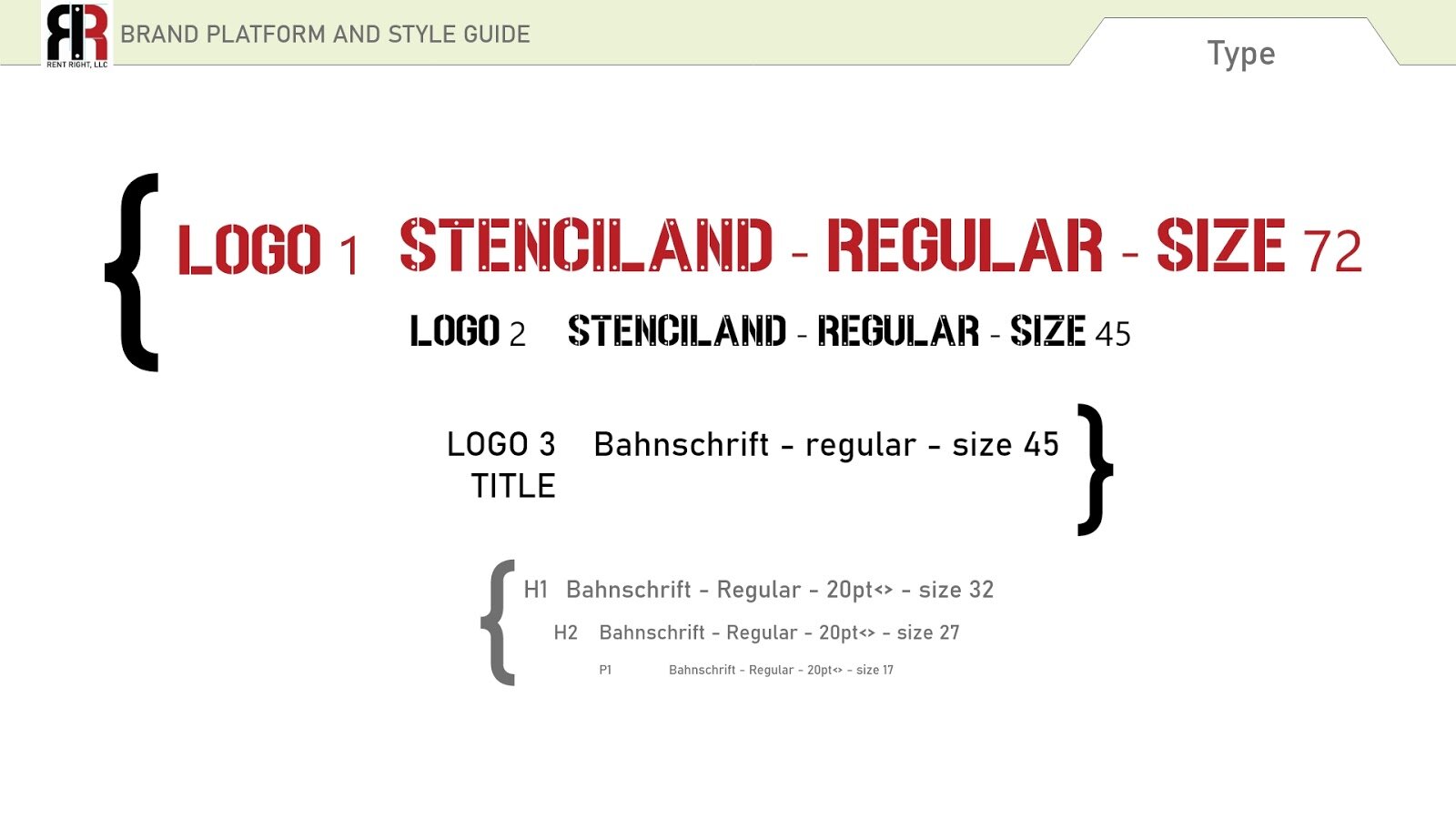
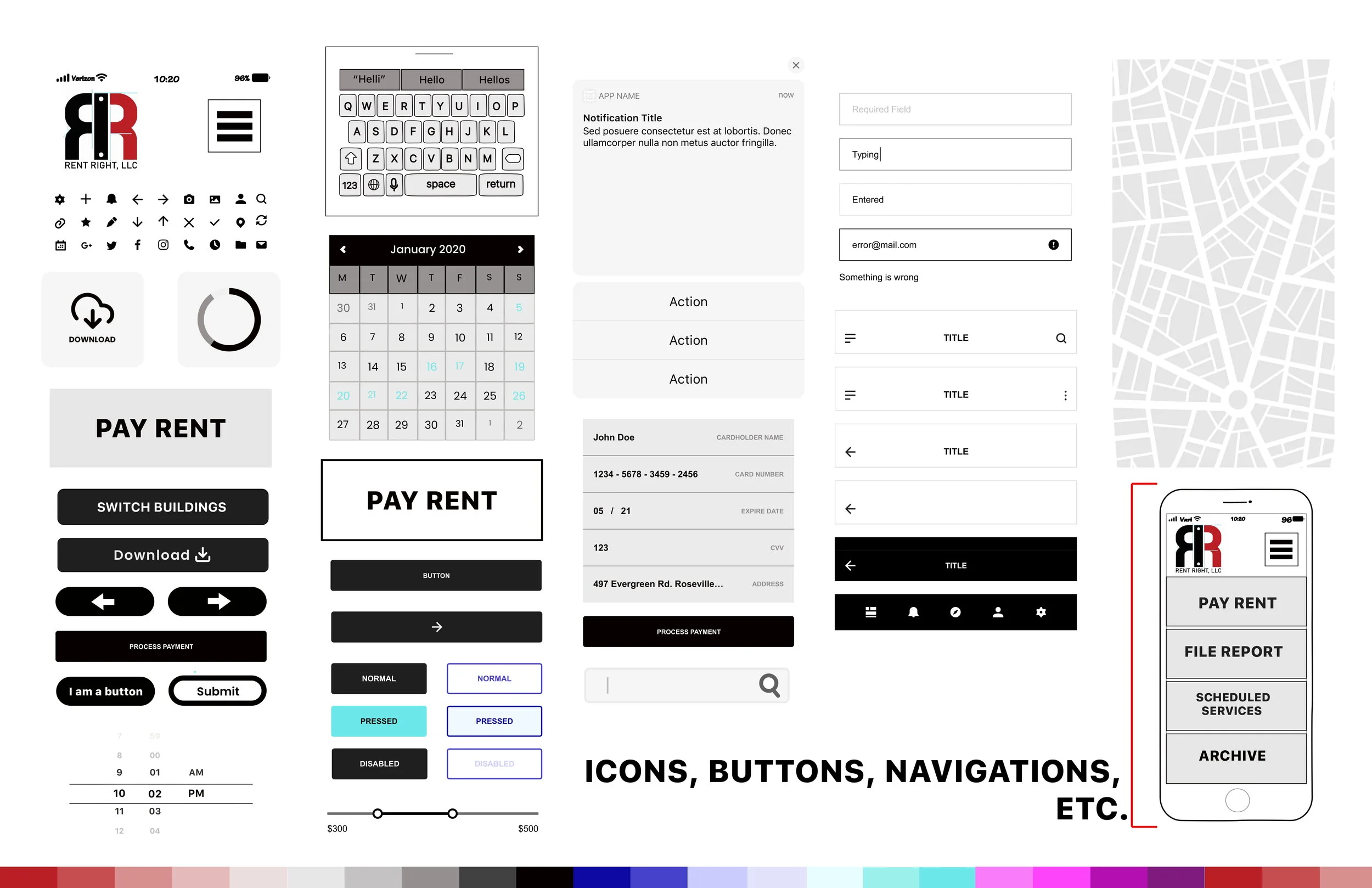
The above images showcase the final iteration (as of this case study) of the style guide.
Now that I had my design systems and style guide, as well as my updated wireframes, based on a validated sketched flow, it was finally time.
The following section breaks down the high fidelity design process, with all of the above in mind.
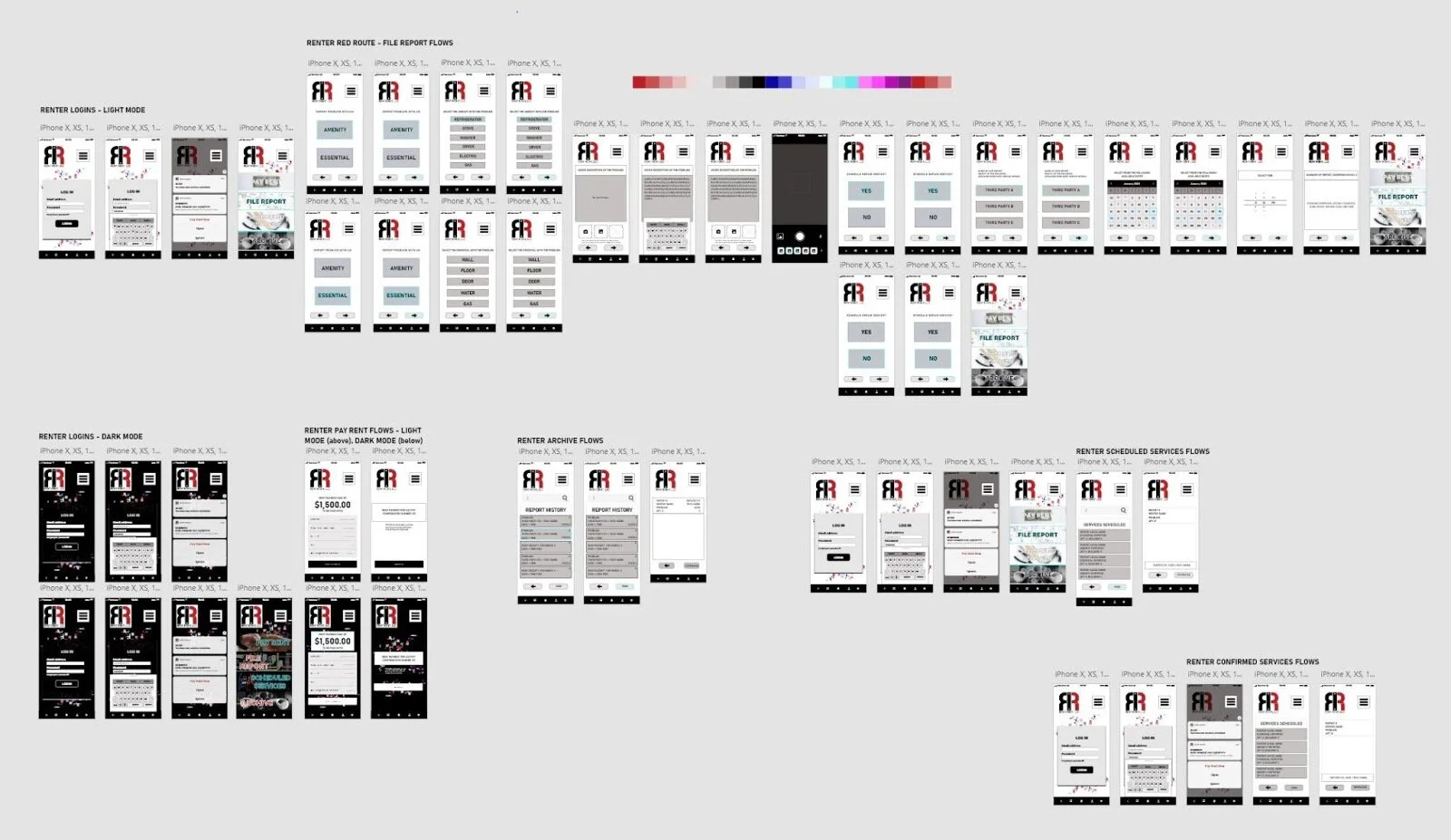
High Fidelity Screens
I set up my high-fidelity file, with each wireframe set, separated by user type. Each user type had a separate Adobe XD file. In setting up my high-fidelity this way, this created a backup of each user and flow type for this more complex file type stage.
As I worked through each user type from login to archive/history, any issues in my design were minimal. These minimal issues were related to overall functionality, and were so discovered and resolved in this single-pass method of creation.
As I completed each user type in a preliminary high-fidelity iteration, each was completed in full to the best of my ability. At no point is there ever room to not check one’s work as they work. Here, however, I found myself creating a cluster of screens with my already developed UI assets/elements, and walking through every potential ‘click’ I created. In using this method of analytical thinking, I was designing my way around any problem in real time.
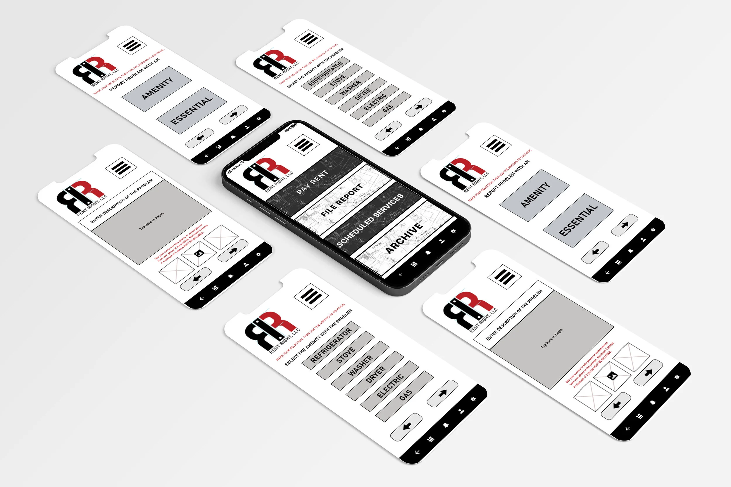
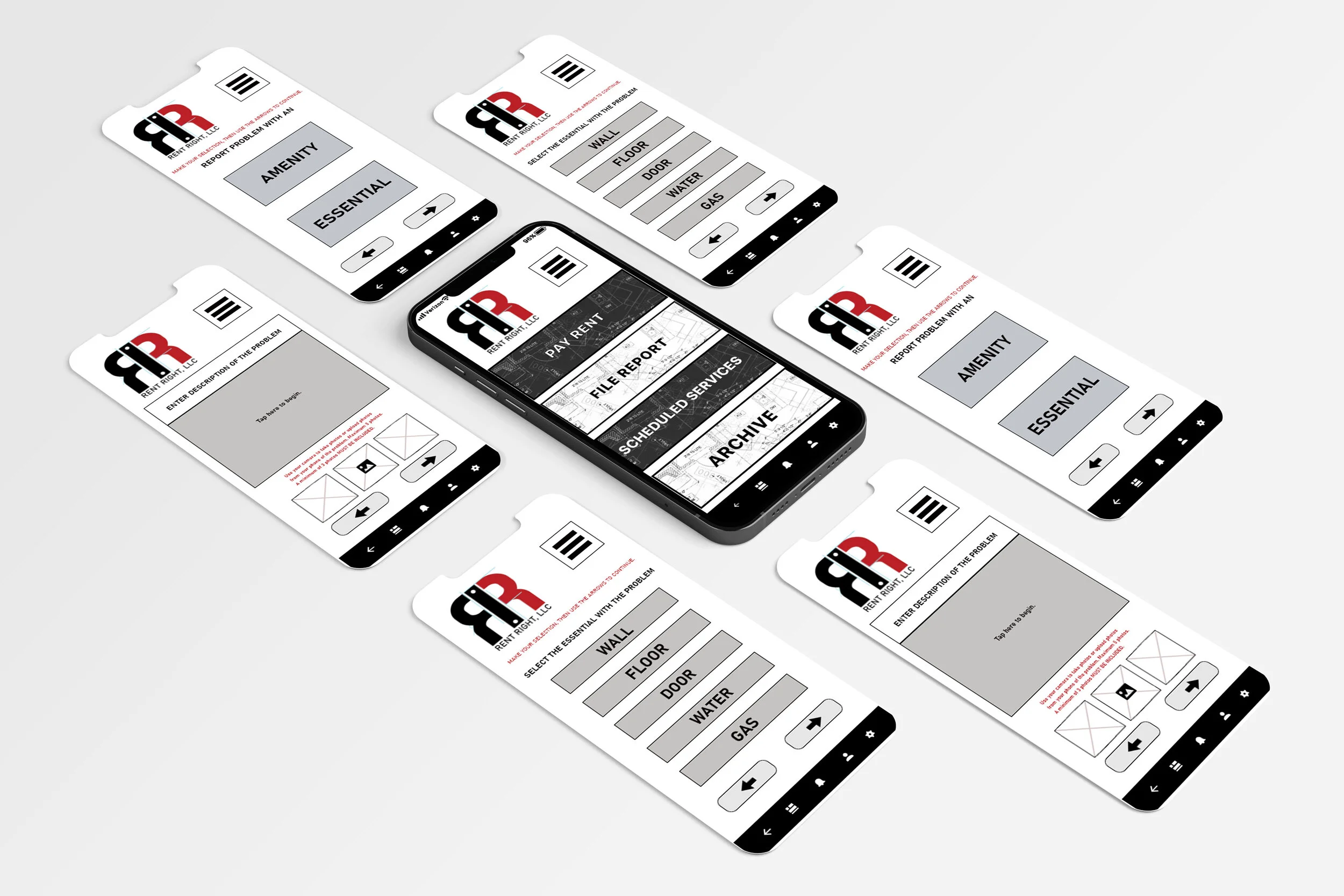
The high-fidelity screens have been included below.
The initial light and dark modes for renter users can be viewed above. I was still experimenting with how the main menu should look, and pushed my design for each using the moodboard/imagery collected in my style guide to build this.
I liked the dark mode iteration here, however, I was unsure how well my design at this point fit the brand overall.
I wondered here if my users would find these main menus “too busy.”
Working through each of these user types in high-fidelity required certain assumptions to be made. Assuming no issues were determined in the sign-up of management, and that management already had a list of applicable third party companies they were already affiliated with (i.e. already in use), which also had no issues in this sign-up, I had to determine what each base would look like. And design in detail for it. The results of which are shown above.
It was here that I realized that the third party could be divided further; management level and service tech level.to complete the map of flows in full circle, there was simply no way a singular third party interface could be utilized effectively.
I made the assumption at this stage that the third party tech would act like any tech repair giant, like Verizon and Xfinity, therefore. This worked with ease into my idea, and resolved what could have been a critical issue.
Prototyping
(InVision vs.
Adobe XD)
Now that my baseline of all user-types had been laid out in high-fidelity iterations, it was time to combine all, and prototype. Adobe XD was used here as well to create the initial iteration. InVision was used next. This proved to demonstrate varied levels of overall success, which was expected. Every step of the design process from idea to prototype requires several iterations, and is not really avoidable--it is very much in fact a part of it.
The Adobe XD prototype and the InVision prototype of this design were developed here.
The InVision app proved to be ineffective for the number of screens I had in total for one user type, let alone all three to be programmed at once. I created a single version which attempted to combine all, but in user testing later, was able to determine this application was simply not built for that many screen and button options in programming to function consistently.
Adobe XD, however, was. This is one of the key factors in the reasoning for it being my favorite tool for this entire design process.
Note the user testing session 1 (below) will be in reference to the initial version. The link shows the initial, as well as the separated user prototypes.
Note user testing session 1 (below) also will be in reference to the initial Adobe XD prototype as well.
User Testing Session 1
I had initially set out to alternate between the two different prototype applications in testing to gain a thorough understanding of my preferred software versus one of the industry standards.
In short, it was learned that InVision was ineffective for prototyping/testing more than a few screens at a time. With this application having approximately 20+ for the primary user type, Adobe XD proved effective for all user types.
Iterations; and User Testing Session 2
After completing my testing session in Adobe XD without any critical issue for my primary renter user type, and adding some requested further instruction to a couple of key frames in the final iteration, I pushed the design further for my other user types for future iterations of prototyping these individually,
I split the third party service company into two categories; management and technician. This was not determined until this stage, however, the building blocks required were already available from all designed thus far. These users can also be made available upon request (for another round of testing).
Below shows some images of these final iterations.
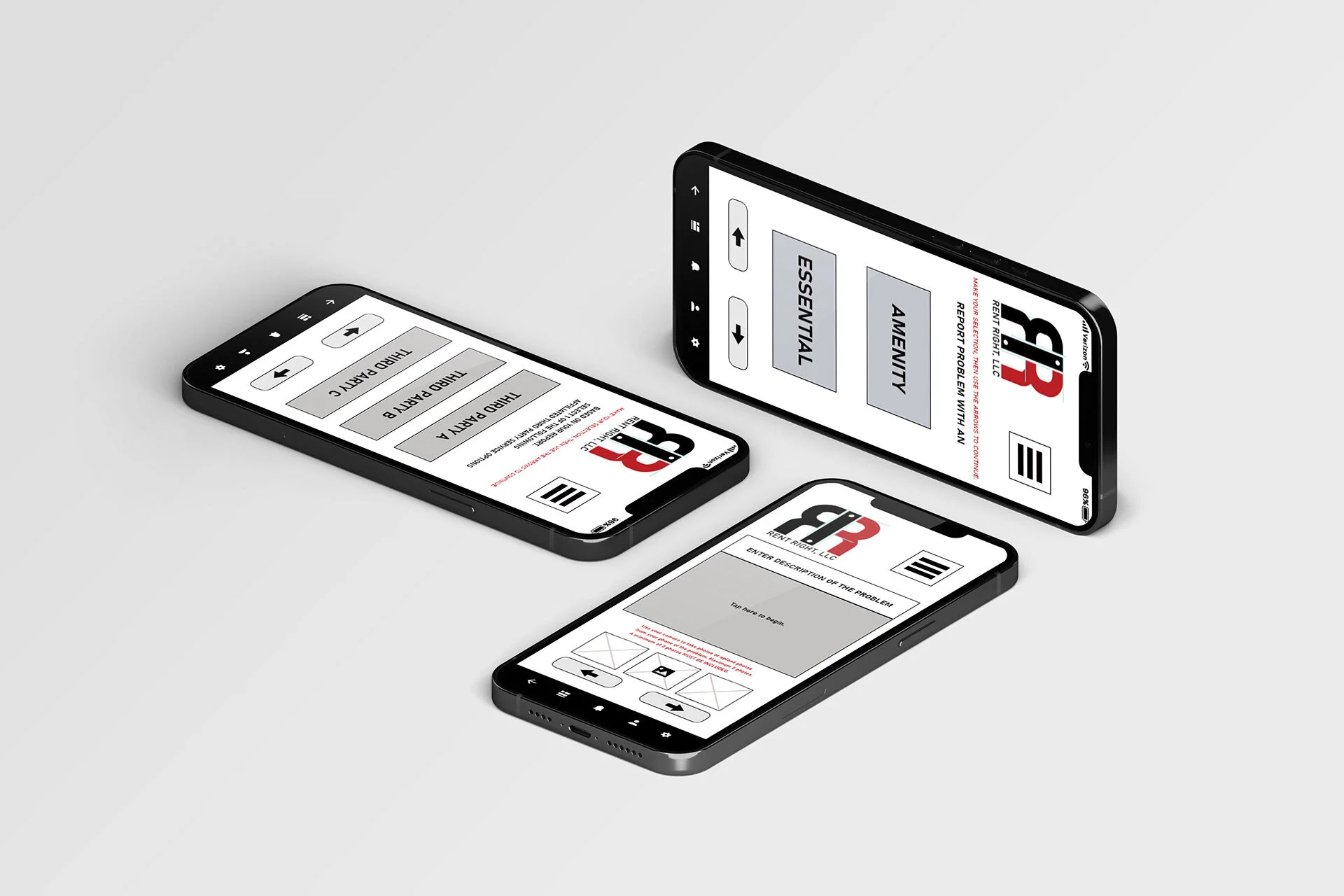
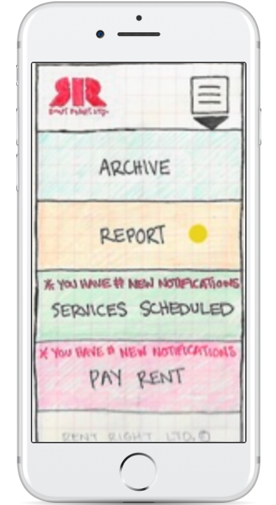
Above shows the final iterations of the main menu as of today’s date. Note the update in main menu background imagery.
I updated my InVision prototype, into a simplified iteration of each user flow, and this can be viewed via the link here.
The Adobe XD prototype can be viewed here.
This XD iteration here should be completely functional. For any comments and feedback, please email at jakkicushi@gmail.com
At left, renter’s main screens are shown, and at right, management’s main screens.
This final prototype (renter user only) can be viewed/tested here.
CONCLUSION
At the start, my simple idea became complex -- real quick.
And in revisiting the idea (this case study) a year later and finding a competitor, I stand by my renter-focused design over the competition’s management-focused application.
This competitor’s reviews remain mixed, while mine remain the same in user satisfaction.
My idea does not outsource to fourth party services to schedule upon its behalf,
And in so doing, my design does not lead renters/users to still have unnecessarily long wait times to ensure standards are kept by said management.
Though my idea unites and secures all parties while the competition attempts to come up with what I already have.
In sticking to the design process overall, no problem -- like ensuring standards of living are maintained and kept for all types of people -- is too big to solve for by design.
Creation, for the sake of ‘moving forward’ as a society, may be as broad of a concept in theory, but it is not impossible in practice.
We simply have to try.
And as for the newly funded competitor that is more of a landlord/management-focus instead of a renter-focus like my idea, like my design here, I stand my ground in where the focus should really be. , I stand by my work here. And From my initial idea, to the final prototype, and to 2021 in this case study update, I have validated that I accomplished my goal.