Resetting the Standard
I joined the Consortium team to improve their SaaS product called “Metrics That Matter,” a cybersecurity platform for CISOs.
After initial discussions with cross collaborative teams, and taking a look at the user journey’s foundation, I planned 2 phases of improvements. The first was to adjust the spacing and color of the information displayed in each interface of the user journey for readability and to meet accessibility standards. The second was to take a find tooth comb to the user journey, designing and iterating a series of new features and adjusting informational hierarchies as a direct result of these big changes to be made.
The image below demonstrates the initial version; the 2 phases of improvements planned from my design concepts; the outcome; and the future phases in subsequent discussion.
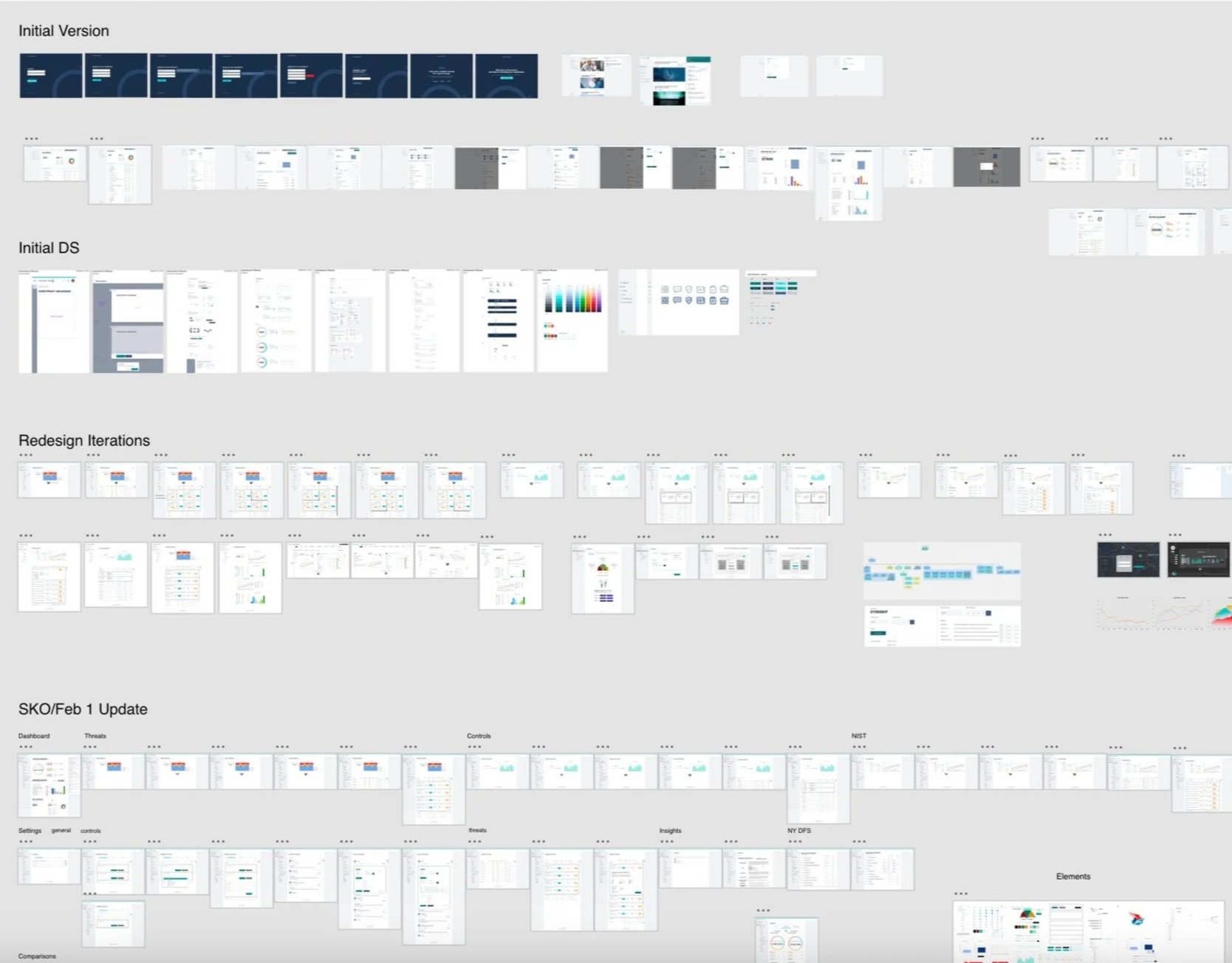
The design system for the product was created, along with this master file above, documenting the entire product lifecycle and establishing the brand.
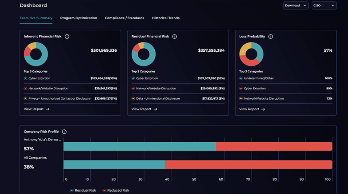
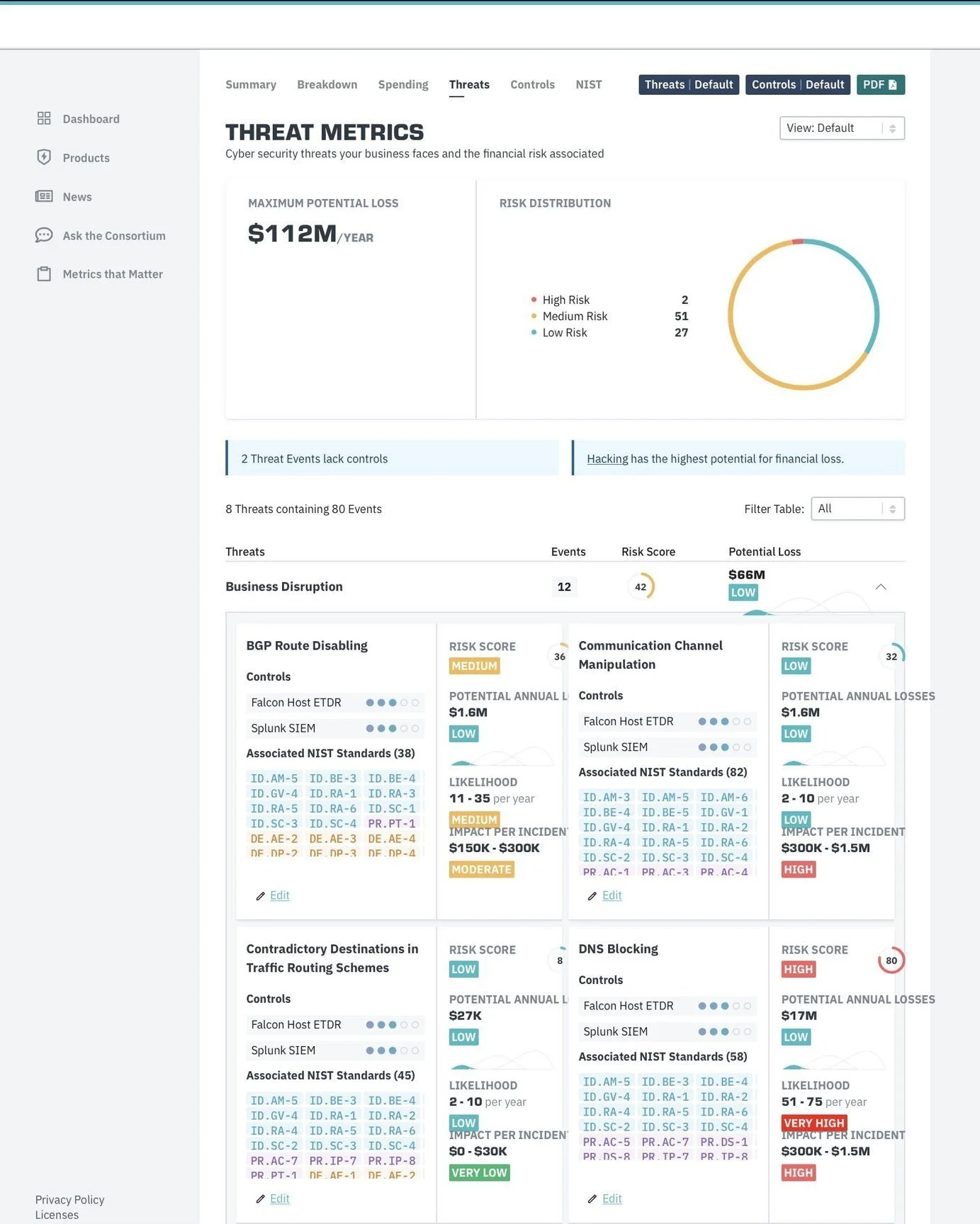
To highlight key changes to the web-based product:
To assist in highlighting this product and its features in a national sales and marketing campaign, I created a series of motion graphic videos for the sales and marketing teams to use in support. The 2 versions requested from the board are below; one simple and silent, the other, with detailed audio. This supported sales and marketing for any context to pitch.
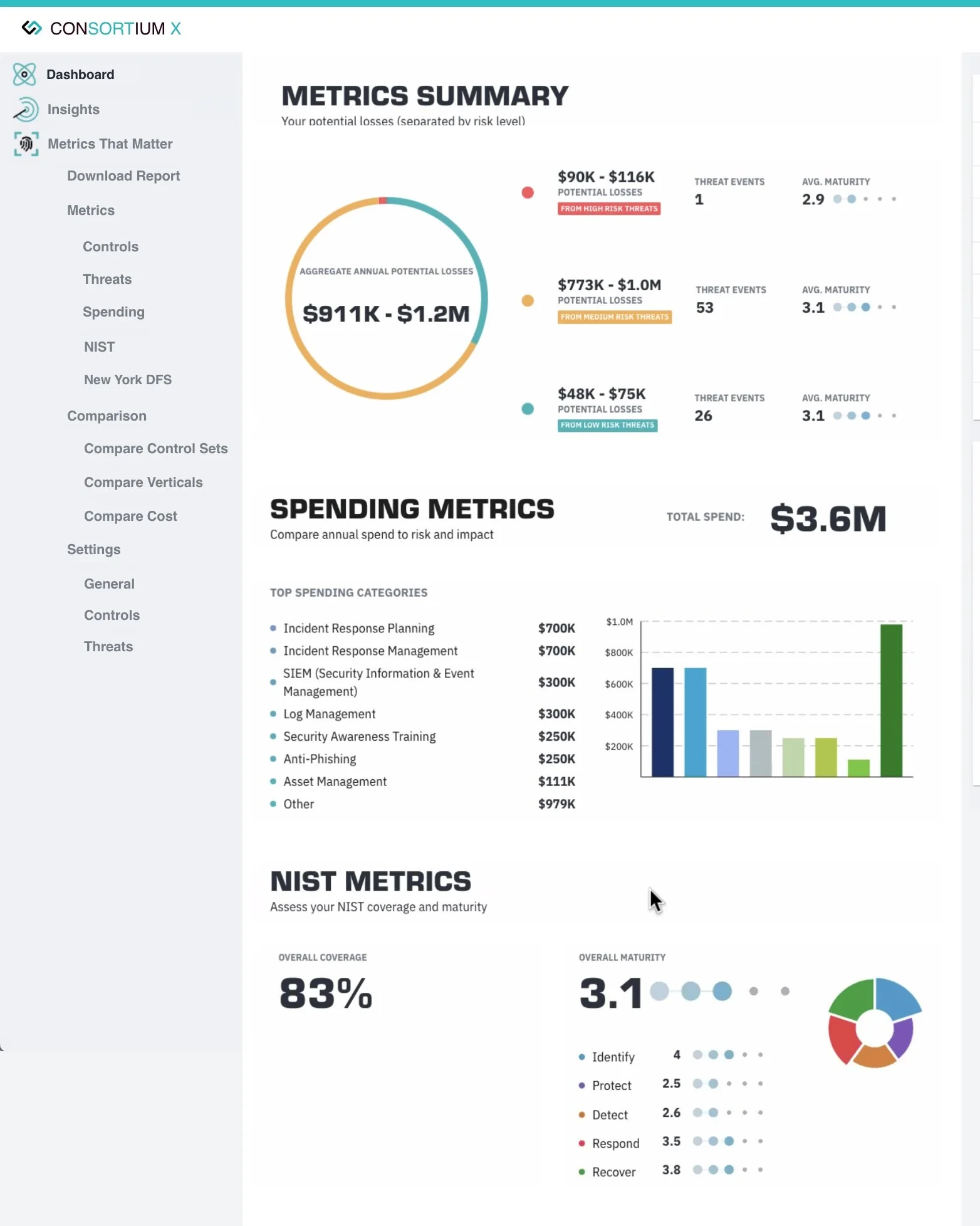
After a year of working here, I got some design help (I was the only designer in the entire company for this time) in the form of a junior designer. I prepared them with a design system handoff, a bit of mentoring, and with the plans for the next phase/future state, seen below in its current live state.
I had advocated for a rebrand at the company’s 5 year mark when I had joined, and it was agreed upon to do this as a 3rd phase, after the first 2 phases of changes I designed.